Choosing Keeping Retro Watercolour Set, Decades Collection

£160.00

Choosing Keeping presents seven exclusive, special editions of 8 shades of Gansai. This Japanese alternative to standard European watercolours is not dissimilar to gouache and is made by a 100 year old paint maker in Japan. The paints can be used directly out of the box with a wet paintbrush - either thinly in translucent washes, or by layering for a bolder effect. These can also be used on darker paper bases to enhance colours further.

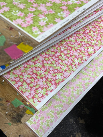
Choosing Keeping's own take on this traditional Japanese art material, each set in this retro collection is inspired by colours of a decade past: 20s, 30s, 40s, 50s, 60s, 70s, and 80s, each has its own appeal. Put together they are the perfect set for a gift. We recommend the Aquarella (white) and Aquarello (off-white) for the perfect paper pairing.

Included with each set is a blank letterpress swatch card featuring each individual colour name to be painted in for colour referencing. This can come in handy as appearances can be deceiving and each colour is only revealed once wet and set to paper!

Details:
Material: Gansai watercolour
Included: 7 palettes each with 8 colours in chiyogami paper presentation box and 7x blank letterpress swatch cards which can be painted in for colour reference. 
Vegetarian/ Vegan: No (contains gelatine glue binder)
Non-toxic
Made in Japan

Colour breakdown: 

1920’s set:
63 - Paaru DaidaiPearlescent orange
75 - Rumi-RoozuLuminous rose
58 - SeikinBlue-gold
29 - Koubai - Japanese Apricot - also known as Japanese plum, this colour is named after much beloved subject matter for painting and poetry in East Asia. 
61 - TououOften translated to gamboge, a pigment made from tapping resin, this Japanese equivalent was once made from yellow grass flowers of the same name and first appears in texts referenced since the Nara period 710 - 794AD
221 - Tokiwa-iroEvergreen; this colour in traditional Japanese refers to the longevity and unchanging nature of evergreen leaves, seen as good luck in Edo period Japan. 
155 - JoushuUpper vermillion 
127 - AokusaGrass green 

1930’s set:
211 - AketsuchiEarthy crimson 
42 - KurochaBlack tea 
36 - Kin-oudoiroGolden ochre 
44 - GunrokuMixed green - traditionally this pigment is made of a mixture of azurite and malachite. 
19 - KawaganeIron skin; when a Japanese sword is made the more flexible interior metal, shingane, is coated in far stronger metal coating - kawagane. 
38 - Kodai-murasakiAncient purple - due to the cost of the pigment, purple was traditionally associated with wealth in Japan and ordinary people were not permitted to wear it. 
22 - KogechaCharred tea
34 - Hadairoflesh 

1940’s set:
213 - Komugi-iroWheat
220 - Ruri-iroLapis lazuli blue 
54 - AaraishuWashed vermillon 
139 - HonaiTrue indigo
9 - YoukouCarmine
35 - SeidouThis deep green usually translates to mean ‘bronze’ but also shares its name with ‘shrine’; picture the aged bronze statues of a Japanese temple. 
41 - BotanPeony
51 - KomidoriDeep green

1950’s set:
32 - KikusaThis literally translates to ‘yellow grass’ despite being very much green. 
37 - Senkouhi - Fresh bright crimson 
205 - TanryokuLight green
222 - Aoi-iroNamed after the light purple mallow flower, traditionally used in Japanese medicines. 
203 - Kurogin-iroBlack-silver
207 - Sakura-iroCherry blossom - named after the much beloved sakura season in Japan. 
224 - Jinkou-chaArgarwood tea, named after the specialised wood that is commonly used in perfumes and incense. 
7 - GunjouUltramarine - in the west this colour, meaning across the sea, refers to the rare lapis that was used to make the pigment. Whilst commonly translated to this colour, Gunjou refers to the pigment made from crushed azurite, not lapis. 


1960’s set:
43 - Sango-iro - Coral
48 - Azuki-Cha - Literally translating to mean ‘Azuki bean tea’, this reddish brown pays homage to the Azuki bean which is ever popular in Japanese cooking. 
26 - Ugoisucha-midori - Olive brown or nightingale tea green? The Japanese are good competition for the Brits when it comes to their love of tea, apparent in their colour naming!
47 - Hatoba - Usually translated to mean blue-black in the context of colour, but literally translating to ‘pigeon wing’, this bold pink references the lighter parts of pigeon feathers. 
33 - Yoneki - ‘American timber’ which is a sandy yellow tone.
35 - Fuji-murasaki - A deep, royal purple named after the spectacular Japanese Wisteria. 
59 - Akagane - Copper or, more literally, red-gold 
46 - Sora-iro - Sky Blue

1970’s set: 
17 - Asagi - A blue green that shares its name with an ancient breed of Koi which is characterised by striking blue scales. 
57 - Kouhaku - Yellow-white
23 - Gin-nezu - Light grey; literally ‘silver mouse’
204 - Mizu-iro - Light blue; literally ‘water colour’ 
2 - Oudo - Ochre; perhaps the oldest pigment, found globally in prehistoric cave paintings - synthetic alternatives to the natural pigment are more frequently used today, as in this instance. 
219 - Rikyuu-Nezumi - In translation this colour combines ‘dark green’ and ‘mouse’ but in practice it is far lighter than such a name suggests.
40 - Natane-iro - Rapeseed 
1 - Enji - Shortened from enjimushi which is the Japanese name for the insect from which the deep red dye carmine is derived. A synthetic alternative is used today.

1980’s set:
201 - Akebono-iro - This light pink literally translates to ‘daybreak colour’: Picture the lightest and subtlest shades in the clouds at dawn. 
216 - Zouge-iro - Ivory
21 - Byakugun - Light blue; in Japanese this colour traditionally describes the pigment made from crushed azurite.  
208 - Amairo - Flax 
76 -  Rumi-Orenji - Luminous Orange 
225 - Bara - Rose
202 - Nadeshiko-iro - This pink is named after the family of flowers we call ‘pinks’ rather than the colour itself: Dianthus. 
223 - Kuchiba - This dark brown literally means ‘decayed leaves’ but more commonly translates to the English colour russet brown.

Swatches and illustrations courtesy of Claire Fletcher and Maria Ines Gul