Japanese Seasons Watercolour Set, Spring
- Description
- History
- Details
- Tech Spec
- Care Guide
- Ingredients
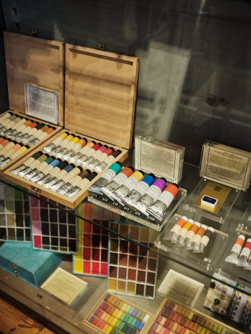
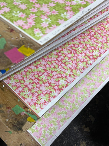
Gansai paints are made in Japan using a colour palette specific to Kyoto, Japan’s imperial capital during the high middle ages, and codified in a colour dictionary pointing to precise references in nature. Choosing Keeping’s Spring paint set borrows from this chromatic lexicon - the bright green tones of Wakaba or fresh leaves, purple from wisteria, and of course pink from, Sakura (cherry blossom), which is a key Shinto symbol of spring. How romantic that Japanese colour nomenclature don’t pertain to chemistry - but rather references subjective emotions and fleeting observations of nature. For example, Akebono-iro - the palest light pink refers to ‘daybreak colour’ or Hatoba which can be translated as ‘pigeon wing’. If you consider that each colour is so well considered, Gansai paints are not intended, at least in theory, for mixing. Compared to the Western style half pans (think Winsor and Newton), they are presented in large and wide full sized pans, designed to be used straight out the palette, ready to accommodate a generous paintbrush without splitting any bristles. Gansai’s particular strength is its versatility - either opaque, thick and creamy for a texture reminiscent of gouache - even pale and light colours can be laid over dark papers with obvious contrast similar to dry pastels. Add water and the paints resemble Western style watercolours - more give, more luminescence and transparency.
- Goes With
- More Like This
Gift wrapping available
Worldwide delivery
FAQ
Do You Offer Gift Wrapping?
Yes, gift wrapping can be chosen before checkout and is a £10 flat fee, which includes a card and envelope for you to leave a message. We use premium materials, our in-house Italian paper and Swiss ribbon and an assortment of branded stickers.
How can I amend my order?
Once placed, orders cannot be modified and the address cannot be changed. This is to avoid errors in processing. If you have made an error, please email to request a cancellation, you can then place a new order with the correct details. Once shipped an order cannot be cancelled, it will need to be returned.
What if something is out of stock?
If an item in your order is unavailable, our team will contact you in writing to let you know and discuss your options. We’ll do our best to suggest alternatives or advise when the item is expected back in stock. During busy seasonal periods, if an item under £10 is out of stock, we’ll issue a refund for that product and send the rest of your order so you receive it without delay.
Can I buy gift vouchers?
Digital Gift Cards can be purchased through our website and are delivered by email, these are redeemable through online purchases only. In-store only gift vouchers can also be purchased by visiting us at our physical store in Covent Garden.
Shipping
International shipping
We ship to all Worldwide destinations exclusively using DHL Express. For UK destinations DHL Express is a 24h next working day delivery service.
Dispatch Time
We aim to despatch orders within 48 hours. At busy shopping periods this can take an extra few days. Orders placed after 1pm on Fridays and at the weekend will be sent out Monday at the earliest.
Taxes
Shipping to USA, Europe, Canada, Australia, and New Zealand will be sent Delivered Duty Paid (DDP). This means all customs duties, taxes, and handling fees are already covered at checkout—so your order arrives without any unexpected extra charges.
About Us

Choosing Keeping is an independent shop located in Covent Garden, London. We specialise in offering a wide range of stationery and miscellaneous items to cater to all your needs.

We take pride in offering products that inspire creativity and elevate the art of writing. Whether you're looking for a special gift or simply want to treat yourself, we invite you to explore our collection and discover the joy of stationery.

We offer gift wrapping with premium materials, our in-house Italian paper and Swiss ribbon and an assortment of swallow branded stickers. We ship to all destinations worldwide by DHL.