On first glance, Rebecca Wallace and Pip Seymour come across as undeniably creative, artistic people – an impression proven true with further conversation. The two have used their decades of experience as artists and paint makers to take on an industry increasingly driven by profit rather than quality and bring painting back into the forefront of art schools’ curricula.
Spurred on by culture wars of the ’90s and early 2000s, when the art theory taught in universities focused on criticism and intellectual ideas over classical and technical classes, the pair began producing paint on a commercial scale, though they had been making it before as part of their own artistic practice. Indeed they could see that painting as a medium was discouraged and underprioritised. By the time the two met in 2010, the list of recommended materials given to art students still reflected that mindset, suggesting the cheapest possible pigments without regard to quality and creating a mismatch between the ideas and talent students had and the work they were able to produce.
‘It’s like trying to be a poet but only being allowed five adverbs’, Wallace explained. ‘You're trying to write something brilliant, but you don't have words to refer to anything from the past or to anything around you. It really is like that because cheap paint is basically filler. It's some sort of clay that, if you're lucky, is tinted, and people become adjusted to it.’
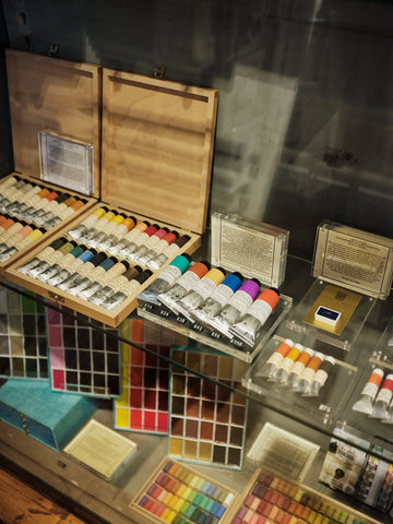
They sought to redress this issue and provide artists, especially art students, access to the paint they see in museums – the high-quality pigments used historically to great effect. Wallace Seymour Fine Art Products was established, sourcing the highest quality pigments from around the world, using them to produce by hand all manner of art materials at their North Yorkshire workshop, then sending them on to art schools and artists.

This spring, Choosing Keeping becomes the only London shop stocking all 193 oil colours in the Wallace Seymour range. To celebrate, we sat down with the artists and discussed their pigments, the history of paint making and all things colour.
Choosing Keeping: Flipping through your catalogue, many colours look the same. Why do you need so many?
Pip Seymour: The bias of each individual colour will be different when you mix it down. These two reds look the same, but when you put white with them, they move in different directions.
It’s also the idea of primary colours. When you’re at school, you’re forced into using primary colours to mix everything. But when you look through art history, you'll see that those primary colours change in each period depending on what pigments are available.
Rebecca Wallace: And some colours exist in their own right, like the earth colours; you just can’t mix them. They’re phenomenal. That’s why there are so many.
CK: In your opinion, which is the most beautiful colour?
PS: We’ve made three shades of lapis lazuli, a natural ultramarine derived from a semi-precious stone found in Afghanistan. One is a clear, bright shade, another has got a slight greenish tint, and the last one is the deepest shade. The colour depends on the quality of the stones.
RW: You can tell it has no filler in it because it shimmers. If you would like to paint like Titian, you can use this to recreate Bacchus and Ariadne. Half the painting is blue – you’d have to spend a fortune on the paint.

PS: This highest grade of lapis lazuli, which Titian used, shows a deep blue violet shade and is about £200 per gramme. Often it is known as Fra Angelico Blue, after the Renaissance painter who used the pigment so frequently it became associated with him.
CK: Why wouldn’t you use something like Cobalt Blue Light instead?
PS: It just has a different resonance.
RW: It glitters; it has a visual vibration.
PS: And it has a cultural identity, being associated with the golden period of Venetian painting in the Renaissance.
CK: What are the trendiest colours? Which colour do you feel captures today’s zeitgeist?
RW: Quinacridone Magenta, a late-twentieth century pigment that creates a strong, luminous colour.

PS: It’s lightfast, so the more it’s exposed to light the more it resists fading. Many synthetic pigments are very bright colours, but if you mix them with white and expose them to light for about three months they’ll fade off. If you do the same thing to the Quinacridone, it won’t shift at all.
CK: On the opposite side of that, what is the most ancient colour, one that has always been around?
RW: Ochres. They are easy to find and paint with, which is why they’re used in cave paintings dating back to antiquity.
PS: We have two yellow ochres. Yellow Ochre Light is from Provence, and Puisaye Yellow Ochre is from north of Burgundy. The Burgundy ochres are stronger than the Provence ochres, and that goes back to the formation of planet earth.

CK: What’s a mistake beginning painters commonly make around colour?
PS: When people are starting out, they tend to just have Titanium White, whereas they need to have Zinc White.
RW: Titanium White is a hideous 1960s thing. Zinc White gives you the power of radiance and doesn’t block out the colour.
CK: Is there crossover between your ranges of oils, watercolours, and acrylics?
RW: We try to put a pigment in as many different mediums like watercolours or oils and acrylic. We even have lapis lazuli in our acrylic. That has never been done before, so we are quite innovative. And the drawing materials – it all integrates.
CK: For a lot of artists, historically and today as well, making their own paint was a big part of the artistic process. Do you feel that producing this paint connects you to that tradition?
RW: In Titian’s time, artists had a studio and a big family to help with paint making.

PS: Prior to the invention of the collapsible metal tube in 1841, artists had to hand-prepare their colours. It was part of the daily process. At the beginning of the Industrial Revolution you start having machine-ground paints. Even then, post–Second World War most art schools would show you how to make paint. It has gradually dropped out of the curriculum, though there has been a revival in more recent years. But the trick is that if you buy some pigments and mix the paint up, it’s great the first time but then you’ve got to do it again and again and try to get it to the same point each time.
RW: And then you’ve got to guarantee the pigment is the right one. So really, we’re filling a gap for artists, like the studios from Titian’s time. And it’s wonderful to kick back at this horrible culture of banning painting in art schools and this bizarre belief that art is all about ideas only. Of course, there are modern pieces that aren’t paintings that do stand up as great works of art. But don’t exclude painting. And the paint an artist uses needs to meet and match the ambitions of that artist.