The King of Pens is here... Long Live the King!

2022 is the year of the Queen, and the country is ready to celebrate the Platinum Jubilee, the 70th anniversary of its longest serving monarch, Queen Elizabeth II.

Here at Choosing Keeping we also are buzzing to introduce you to our personal brand of royalty, the Sailor King of Pens, elegant, prestigious and resilient, with its vintage touch that warms the spirit and never ceases to inspire.

Besides the appeal of its look, embellished by a stunning 21k gold nib, the King of Pens boasts a prestigious heritage, for it is made following the ancient Eastern tradition of  urushi lacquer. Sources disagree on the origin of this fascinating technique, with some experts dating it back to three thousand years ago in China, and others placing the use of lacquer back to 7000 BCE Japan, but it’s undeniable that both traditions have influenced each other, and Europe, for centuries.

Japanese artists perfected the craft of decorated lacquerware during the 8th century, but it reached its peak in the twelfth century, at the end of the Heian period (794-1185).

In Europe, especially in France, urushi lacquer became so popular that the French coined the term japonner to designate the process of lacquering or varnishing objects; rumour has it that Marie Antoinette herself built up such an incredible personal collection of lacquerware that she asked Jean-Henri Riesner, popular cabinet maker at the time, to build a bespoke one for her precious collection. But the Queen of France was not the only one burning with the lacquer fever: since most of the pieces were customised to suit Western taste, from the 16th century onwards Japanese lacquer art was the most sought after product to be exported from Japan by Portuguese traders, an appetite that seemed to wane between the end of the 18th century and the 19th, until the Art Nouveau period rekindled people’s interest for all things Japanese.

Japanese lacquer’s rich history can only be matched by the astounding and complicated process of producing it: the lacquer, or urushi, is made from the sap of the homonymous tree, and the extraction process is dangerous since the liquid is poisonous to the touch in its raw form, and its fumes are toxic to breathe. Only the most experienced producers in Japan - for the procedure has been passed down to generations for thousands of years - can approach this difficult task.

Moreover, the harvesting of the resin can exclusively be done in small quantities, so to make the incisions - applied to the bark to extract the greyish-white juice - effective. After a careful harvest they must wait at least three to five years to treat the resin and obtain the resistant and viscous textured lacquer that we all know and love. After filtering, homogenisation and dehydration (with very strict temperature and humidity levels), the final product loses its transparency in favour of a black, green red or brown tint, finally applied in thin layers until the final result is satisfactory. The process to layer the urushi lacquer is labour intensive and time-consuming, and each pen crafted by named urushi artists can take up to 1 year to produce.

Beyond its aesthetic merit, urushi lacquer also acts as a protective casing because it is acid-free, alkaline-free, and resistant to both heat and water.

It comes as no surprise that the combination of its rarity and the painstaking and highly technical processing of urushi lacquer makes every object a small treasure.

Along with the unique pleasure of holding a pen with such rich history and meticulous craft, you can savour the thought of an item that has fought against the never-ending grinding of our contemporary lives and came out victorious. It is care, precision, time and a century long tradition that have crowned His Majesty the King of Pens for the world to desire, but only a few to enjoy.

Shop all King of Pens here

Mais Oui... Ohnishi!

Choosing Keeping’s lucky regulars already know a little bit about the genesis of one of our beloved fountain pen brands, Ohnishi Seisakusho: legendary Mr Kato Kiyoshi, affectionately nicknamed in the trade "the Father of Pens", began producing pens at age 19, after his father passed away shortly before WWII. According to the lore, Mr Kato is said to have kept a large quantity of celluloid rods buried in his back garden, which he dug out once the war was over. Later on, thanks to that very celluloid, he established his own pen company, eponymously named the Kato Seisakusho Company.

Notorious for his mis-adventures as much as his entrepreneurial spirit - rumours of camel-riding and bribes have been enriching his fame since, only the greatness of his pens can be a match for Mr Kato’s.

Although celluloid, one of the earliest thermoplastics, is becoming an extinct base material for pen making, Mr Ohnishi - who succeeded Mr Kato after his passing at the age of 85 in 2010 - continued to work using materials in limited supply until the end of production of celluloid in Japan. 

Cellulose acetate - with its natural feel and nostalgic appeal - had to step in as a replacement for the disappearing celluloid, and it retains decades long popularity for making everyday items such as glasses frames, combs, fashion accessories, pen barrels and toys, objects handled often and beloved by many.

Few plastics can boast such a long pedigree as cellulose acetate, and its history involves a fair amount of genius, a pinch of luck and a lot of trial and error: first prepared in 1865 by French chemist Paul Schützenberger, it was patented in the UK by Charles Cross and Edward Bevan in 1894. In 1904, Swiss siblings Camille and Henri Dreyfus performed chemical research and development on cellulose acetate in a shed in their father's garden in Basel, then a crucible of the dye industry. 

During WWII the British and the American Governments commissioned Dr. Camille Dreyfus to set up factories on their territory, due to its military applications - especially for stiffening fabric covered aeroplane wings. 

Internationally renown for its use in the textile industry, today cellulose acetate can also be found in everyday objects, especially in the life-long endeavour of putting pen to paper. 

And now, without further ado, let us present you Choosing Keeping special edition Ohnishi Seisakusho pens - a cross cultural Franco-Japanese production bringing luxury spectacle acetate patterns to the stationery arena: Nightshade, Tutti Frutti, Peacock, Koi Pond, Lemon Sherbert and Citrus Twist.

Turned entirely by hand by Mr Ohnishi himself, every piece is born out of his decennial experience and meticulous eye to gauge each component, encompassing both Mr Kato’s and Mr Ohnishi’s experience and a brand new series of colours, uniquely selected by us.


Shop all Ohnishi Fountain and Ballpoint pens and choose your favourite acetate colour combination.

A Brief History of Repeat Patterns

As the philosopher Isaiah Berlin once said, ‘To understand is to perceive patterns’'; this couldn’t be more apt for recognising the importance of pattern design throughout history. 

Whether as a way of story-telling, marking territory, or communication, the need to create patterns has been a vital tool in human civilisation since time began and often gives us an insight into society, culture, trends and the current zeitgeist of the time period. The art of making and printing repeat patterns has developed throughout time, reflecting advancing techniques and technologies.

New printing techniques throughout history have revolutionised the production of patterns. Woodblock prints first seen in Asia and then in Europe in the 15th century made it possible to reproduce patterns over and over again, making highly decorated papers more widely available. These printed papers were often used for books covers, linings for cabinets and cases, good luck omens, wrapping for food stuffs and even early forms of paper currency. 

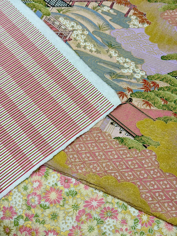
In Italy, the Remondini family became masters of this technique and their designs became wildly popular in the 18th century; you can see examples of their work pictured. Later on, processes such as screen printing, where ink is pushed through screens apart from areas blocked by a stencil coating, made printing multicolour designs more accurate and streamlined, eventually leading to mass production. 

Alongside these technological advances, changes in tastes and trends have meant the way in which repeats are drawn have altered and developed, as the type of repeat chosen can completely change the look of the pattern when printed. For example, a block repeat, where the motif is repeated in exactly the same way horizontally and vertically, can make the repeat obvious and therefore the look more regimented or geometric. In contrast to this, a drop or half-drop repeat, where the artwork repeats along the horizontal line but drops on the vertical line, can work well to disguise where the print repeats lending itself well to more flowing and complex designs. 

Other repeats including brick, diamond, ogee (a long diamond) and mirroring, which were favoured by designer William Morris and the Arts and Crafts movement, have gone in and out of fashion over time. Limitations on repeat sizes have also changed, where once they were constricted to either the block or screen size, with invention of digital printing this has been revolutionised and now repeats can be any size the heart desires!

Shop all of our Italian gift wrapping papers here and find your favourite repeat pattern.

John Derian Decoupaged Paperweights

“A rose by any other name would smell as sweet" - as our very own William Shakespeare would say - and, boy we are here to smell the sweet Valentine’s roses, aren’t we?

Yes, Valentine’s day is indeed approaching, and here at Choosing Keeping we have laid the fluffy red carpet of love all over the shop.

If you are looking forward to the proverbial butterflies, the moonlit walks, the dinners by candlelight and chocolates a plenty, nothing whispers I love you like a John Derian paperweight. Produced by hand in his New York studio by the designer himself and his small team of artisans, these works combine the art of decoupage with John Derian’s love for paper and ephemera.

To decoupage - a Middle French word that translates into “to cut out” - means decorating an object by gluing coloured paper cutouts onto it in combination with special paint effects, gold leaf and other decorative elements. After each layer is sealed with multiple coats of varnish, the final product looks like painting or inlay work.

Despite its French meaning, the origin of decoupage is thought to descend from east Siberian nomadic tribes that used cut-out felts to decorate the tombs of their deceased. From Siberia, the practice came to China, and by the 12th century, the art was fairly popular in the region. But it was only in the 17th century, thanks to the trade links between Venice and the Far East, that the cut out paper decorations made their way into Europe. 

England itself had a craze for decoupage in the 18th century, when Mary Delany achieved fame at the court of George III and Queen Charlotte for creating cut-out paper artworks of detailed depictions of plants. Her 1,700 decoupage pieces - which she called “Paper Mosaiks” - can be seen in the Enlightenment Gallery at the British Museum.

John Derian, with his vast archive of 18th and 19th century prints, has a well of experience and material to create his decoupaged goods: from flowers, to birds, to colours and natural elements, you too can master the language of love with our assortment of romantic and carefully crafted paperweights. 

John Derian Paperweights can be found here with designs suitable for all occasions. 

For those looking to explore decoupaging and decorating, the John Derian Sticker Book is now available with over 700 stickers to adorn any surface. 

The History of the Paperclip

The act of fastening papers together can be recalled from as early as the thirteenth century. People would use ribbons, later dipped in wax to fortify them, to tie their pages together and would continue to do so until the steel-wire paper clip was invented. According to the Early Office Museum, the Gem paper clips that we offer in store were first introduced by Cushman & Denison who, in 1904, obtained a trademark for their ‘Gem’ paper clips. The announcement of the trademark stated "Used since March 1, 1892," so it is probable that the Gem Paper Clip was introduced on that date. We also offer the spiral paper clip, first patented in the US under the name ‘Kurly Klip’ and ‘Nifty Clip’ in 1936.

 During World War Two, Norwegians living under Nazi occupation wore paper clips as a sign of resistance. Students at Oslo University started by wearing paper clips on their lapels in addition to wearing paper clip bracelets and any other type of jewellery that could be fashioned.

It must be said, however, that the reasoning behind this is based on the physical attributes of the paperclip and not on the erroneous postwar myth that Norwegian, Johan Vaaler (1866–1910), was the inventor of the paper clip. The clips were meant to denote solidarity and unity and the wearing of paper clips was soon prohibited, with wearers risking severe punishment.

Nevertheless, the paper clip has become a symbol of national identity within Norway - although the giant paper clip in Sandvika, Norway actually depicts the Gem and not the clip designed by Vaaler. 

 And as we moved into the digital age, the trusty paper clip didn’t disappear but evolved into the form of the tragic and much-maligned Clippit (1997-2004) in Microsoft Word. It would be too extreme for me to blame the unpopular Microsoft Office Assistant for the contemporary oversight of the paper clip but certainly he represents the liminality of the early 2000s as we entered an evermore paperless society. 

The paper clip, as simple as it may be, always seems to be at the forefront of cultural development. Perhaps this is because of its apparent ‘simpleness’ or its humble aura but it underscores the intricacies of the fast paced developments since the industrial revolution and the society behind it - after all, there would have been a time when the paper clip was cutting edge, or even a statement, only now it is something that we received from a Christmas cracker circa 2005 and rarely think about. 

You can find our full range of paperclips here

Strawberry Notecards

It is not only the border of wild strawberries that make our new letter writing sets so cute; the embossed intricate scalloped edges, reminiscent of hand embroidered handkerchiefs, feels so delicate and precious in the hand that your party guests will certainly be anticipating dainty patisseries at your afternoon tea. 

Embossing is the process used in the printing industry to transform a flat piece of paper or card stock and add a raised 3D design or texture to the printed design. This technique has traditionally been used to add faux leather textures into paper, for luxurious personalised stationery, Victorian decorative scrap designs, postage stamps and official seals on certificates; it adds texture and contrast to any printed design as the raised surface will catch the light. An embossed image is raised from the flat surface and a debossed image is concave into the surface. To achieve this technique, two engraved dies are needed: one that is raised and one that is recessed, fitting together perfectly so when the paper is pressed between them, the pressure of the printing press causes the paper to permanently warp into the design by altering the structure of the fibres within the paper. 

Sometimes the embossing is simply all you need and no ink is printed to add another layer to the design - this is called blind embossing and can be seen at Choosing Keeping on the camellia and lily of the valley cards but also on the strawberry writing papers as the delicate lacy border and the subtly embossed line guides on the paper, to help you write your party invites in a straight line with a considered composition. 

We believe a hand printed textural element in a printed design feels significantly more qualitative than that of a flat digitally printed card, as it draws on additional senses as you open the envelope and read the notecard. 

Decorative strawberry scalloped edge handkerchief writing papers, flat cards and envelopes are available in packs of 10 at Choosing Keeping now.

Mochaware 

The earliest mochaware pots with slip decorations were made in England circa 1770 in Stoke-on-Trent, Staffordshire. At the time mochaware was one of the relatively cheaper forms of decorated pottery and the result of mass manufacturing and the mechanisation of ceramics during the industrial revolution. Using liquid slip wet clay, stained with oxides to create patterns on the surface of the thrown vessels was a cheap and quick way to add a design to domestic ceramics. Compared to other styles of pottery at the time, for example Wedgewood’s Jasperware, this technique was unsophisticated and slightly slapdash because of the unpredictable and messy nature of the slip application, but resulted in some charming techniques and unique patterns. Hand drawn designs could be achieved by applying the wet slip through goose quills in a free flow way. Some later, more refined designs were created by engine-powered lathes that cut into the leather hard clay in shallow, regular patterns; as the colour was removed by the machine, the pattern was revealed.

The term Mochaware comes from the moss agate stone, which features sprawling natural patterns similar to seaweed. It was shipped in large quantities (alongside coffee) from Arabia to London in the late 18th Century through the port of Mocha, al Mukha in Yemen, on the Red Sea. Mochaware was named after this stone due to the uncanny resemblance to the seaweed or tree design (featured on this small vase below) which was created using a technique coined ‘mochaware diffusion'. 

Bands of colour were applied to the pot, and, making sure the slip was still wet, the vessel was held upside and dotted with a darker slip followed by few drops of tobacco-infused water. The acid in the tobacco reacts with the alkali liquid clay, causing a chemical reaction where they repel each other. Legend has it that this reaction was discovered by accident when a worker in the potteries accidentally spat his chewing tobacco into the bucket of coloured slip. The same effect can be achieved today using apple cider vinegar and manganese dioxide.

In the mid 19th Century, the potteries that manufactured mochaware focused on producing jugs and mugs with government stamped capacity verified measures, e.g 1 pint, for use in pubs. As mochaware was an everyday item and, for many, not a prized possession (imagine how many mugs were smashed in the pubs of Victorian Wapping and Rotherhithe) original mochaware is now very hard to come by. Today it is probably easier to find a shard of Victorian mochaware on the Thames foreshore than it is to find an unchipped piece on eBay! Luckily we have saved you the trouble as we have a wide selection of handmade mochaware pen pots and vases available at Choosing Keeping.

Find our full range of Mochaware here.

Seed: Enough Erasers for a Lifetime of Mistakes

As with many suppliers, we have a special place in our heart (and assortment) for the “first’s”, and Seed is responsible for the world’s very first vinyl chloride, or plastic, eraser patented and commercialised under the trademark “Radar” in 1955. If you can reminisce and consider the wonder that cute, perfumed, food shaped erasers impressed onto a 6 year old circa 1986, then you will understand that such a company has made a significant cultural contribution to the world worth gushing about.

To give some context, let’s discuss early eraser production. Before industrialisation, there was no broad demand for erasers. Specifically in Japan, for cultural reasons also, ink and brushes were the main writing supplies and only in the latter part of the 19th, when political mandates for universal education cropped up worldwide, did modern-day stationery supplies become household items. Domestic production of erasers in Japan was a small side line to transforming rubber into other consumables such as boots, hoses, tubes, rubber bands… Yet with the advent of plastics, the new material demonstrated some obvious advantages: odourless, more stable to store, without hardening, and generally more performant. 

Seed wasn't blind to this opportunity and in 1950, originally known as the Miki Kosaku Rubber Co., the company changed its name and relaunched itself as a plastic eraser-only producing manufacturer focusing on its new patented invention.

Thankfully the Radar eraser is faithful to its original 1955 inception design, resisted embellishment, conservatively functional - simply a white block, with a 97% erasing capability, cased in its graphically punchy blue packaging. 

Indeed manufacturing heritage is something to be proud of and it is amazing to think that Seed’s very own manufacturing plant also miraculously still stands, 100 year on, a time capsule in an otherwise peaceful and residential Miyakojima, a north east neighbourhood of Osaka, once a place burgeoning with industrial development and the vast transformations, in economy and society, brought about by the Taisho era. Indeed the illustrated postcard and our own photograph from our trip a few years ago (see right - this image is unfortunately as much as you will see from our visit as inside is strictly “no-photography") both identify the same building captured some 100 years apart!

Read the full article!

Astier De Villatte 

After graduating from art school, Ivan Pericoli and Benoît Astier de Villatte were looking for an outlet for their education. Though they began by making furniture together, they quickly expanded into ceramics, as Benoît’s father had a kiln. A family affair, compiled of the Astier de Villatte siblings, they decided to found the company known as Astier de Villatte in 1996, celebrating the ‘art of the table’. The founders focused on creating objets rêvés, or dream objects, inspired by flea markets, second-hand and antique shops, and even fly-tipped furniture on the pavement of the Parisian streets.

Originally, the works were created in the family home until they set up a basement workshop in Daumesnil in Paris’ 12th arrondissement. After many successful appearances at trade fairs, they opened their flagship store in 2000 beside the Royal Palace on rue Saint Honoré, expanding beyond ceramics into fragrances, incense, and printed goods such as notebooks and diaries. Their wares have included collaborations such as their ongoing relationship with decoupage enthusiast John Derian


The ceramics are made with the traditional estampage moulding technique, using black terracotta, which is then lathered in the company’s signature milky white glaze. The clay used is traditionally for sculpture, rather than ceramics, so there are many nicks and pores in each finished work; every blemish is intentional as the imperfection of the objects is entirely their charm. 

What makes their wares so coveted is not just their attentively detailed production; it is also their penchant for playful, 18th Century inspired imagery, including this cat face trinket dish, a palm-sized catchall perfect for jewellery and other knick-knacks. As cat fans here at Choosing Keeping, it was a simply irresistible addition to our collection of Astier de Villatte ceramics. 

Glazed ceramics on the shelves of the Astier de Villatte factory.

Wooden moulds for each piece on shelving in the factory. 

A Marie Antoinette incense dish before firing. 

Find our full Astier de Villatte collection here. 

Swiss Wood Pencil: Strong, Smooth, Dependable and Environmentally Friendly!

When I was a little girl I was absolutely certain that cows in Switzerland were purple and everybody made watches for a living. Once I’d outgrown my serious fixation for Milka chocolate - and the purple cow syllogism within - circa 1999, I started exploring a fairly excessive amount of creative endeavours: writer, journalist, illustrator, mangaka (comic artist sounded too mundane at the time) and philosopher (yes, I know right?!), and they all had one thing in common: the earthy and smooth vibes of the Caran d'Ache Swiss Wood 348 HB Pencil I envisioned my future self holding. 

An unusual pencil from Caran d'Ache, made from Swiss beech - sourced in Glovelier near Geneva, in the Jura county - rather than the traditional cedar wood, the 348 HB is both thicker and heavier than normal pencils. The use of beech wood gives this pencil a sturdy and firm feel. Although here at Choosing Keeping we are not fans of stationary nationalism, one can only appreciate the glossy red enamel and the white Swiss cross printed on the end, a bold final touch to a smooth and evocative pencil that smells like a rainy bonfire. Not too much rain, the right amount of rain: cosy and blanket friendly. 

A bit wider than a standard hexagonal pencil, you might need to pair it with one of our KUM 100th Year Anniversary Glass Jar Sharpener, an ideal match in elegance and tones. Whether I fancy myself a writer or I am only scribbling notes on a post-it, the Swiss Wood 348 is my go to pencil for several reasons; some purely romantic...


Like the feel and the smell, the idea that I am holding a tool for greatness - and some strictly technical: it is smooth and silent on the paper, it allows you to write fast and clean, sturdy on the page and reliable. It keeps a good point throughout, and although with some serious effort it might smudge, I could erase it with almost no trace of the previous wording, which is immensely reassuring for those who, like me, enjoy dwelling in previous mistakes if given the chance.

And last but not least, Caran d’Ache Swiss Wood pencils are the only one in the world to be COBS certified (COBS stands for “Certificat d’Origins Bois Suisse - Certification of Swiss wood origin”) and complies with the FSC and PEFC labels, which ensure that the wood comes from Swiss forests. Trust me, when it comes to forest regulation laws, Switzerland has the strictest controls in the world.

I am feeling better knowing that the production of Swiss wood pencils plays a key role in the conservation and upkeep of local forests. It helps promote know-how and support the local economy while reducing transport distances. This approach is a continuation of the environmental policy implemented by Caran d’Ache since its founding in 1915. 

Caran d’Ache Swiss Wood pencil, you beauty: strong, smooth, dependable and environmentally friendly!

From the Caran D'ache website: Wood from which pencils are made!

The Magic of Iron Gall Inks


The fountain pen connoisseur will surely know - and perhaps be a bit wary of - iron gall inks. Known for their lightfast properties (and potential to clog up and damage the insides of fountain pens) this type of ink is also known as oak gall ink. This speaks to their method of production as one of the two key ingredients is tannic acid which is traditionally found in the gall of an oak - this is a swelling on the outside of the tree which is cased when injected with the larvae of a specific species of wasp.

The deep, blue-purple colour of traditional iron gall inks is due to the chemical reaction that occurs when fermented tannic acid comes into contact with ferrous (iron) sulphate. The resulting liquid is filtered then mixed with a binder, such as gum arabic, before being ready to use with quill on parchment. It is permanent and many historical texts have been written in it (such as the Book of Magical Charms, pictured above, which dates back to the 1600s and contains pages of chaotically scrawled magical musings). 

The permanence of these inks lead to their use in writing important documents - once on the page there is no way to erase or tamper with the written word. Despite this, however, the ink is unstable and the high acid content means that over centuries on paper the ink can corrode through the page, resulting in a 'ghost' effect for the oldest texts. 

 Another commonplace name is common or standard ink; this is because it was the standard composition of inks from the fifth to the nineteenth century. First recorded in some capacity by Pliny the Elder (23 - 79 AD), it was only in the twentieth century with the introduction of easier-to-manufacture, and less unstable, dye based inks that iron gall was rendered a novelty rather than the norm. Some modern manufacturers have been able to adjust and optimise the recipe to suit fountain pens; Platinum for example produce an excellent range of gall inks with the acidity content lowered to a non-harmful level. These inks beautifully display the most mesmerising quality of the inks - as they dry, the colours quickly change before your eyes with exposure to light and air, leaving your page of writing in a slowly changing ombre of sentences. 


"To taste the flavor of iron gall ink history thy taketh...
... one gall wesp on a mediterranian oak tree twig
3000 miles of Gum-Arabic traderoutes
take likewise 5 ounces of mint-green vitriol from a deep dark mine
whereinto put 1 pint of ancient rain water.
Choose a moment in time and a thought to convey.
Mix and stir them every day three or four times thoroughly.
Finish off with a pinch of blotting sand.
Wait a few centuries and discover a testimony of history."

Thanks to the iron gall ink website for this bizarre poetic recipe!

The Importance of Water: Paper Making with MD

Paper is fundamentally made from just two ingredients: wood pulp and water. Before production starts it is important to ensure that, for top quality papers, the best of both is secured. In fact we have been told by our friends at MD Paper Products that the key to good paper is access to a good, clean and well managed fresh water source.

It is no accident that paper mills are most commonly found on rivers - the Japanese factory where MD paper is made relies on river water which is carefully filtered for optimal results.

Water composition and viscosity can vary significantly depending on the time of year so MD are careful to adjust their refinement accordingly so that they can maintain their high standards year round. River water is used by many Japanese paper makers: Tomoe River for example, seriously thin but remarkably smooth paper which is renowned by fountain pen users worldwide, unsurprisingly takes its name from the Tomoegawa River which fuels its production. 

At MD, once the wood is pulped and washed in the purest water, it undergoes a drying process where that ever important component is taken out. In a mass produced imitation of traditional Washi paper production, the pulp covers a wire mesh which quickly rotates to even out and sift the material. Once the moisture has been removed the paper continues on its journey, going through a number of additional processes, before and during binding, until it reaches the awaiting pens of the consumer. 

MD take great pride in their relationship between nature and production and are keen to respect their natural environment by supplying only the very best in true Japanese minimalist style. They keep their notebooks straightforward and simple so as not to mess around with their proven formula - MD notebooks are commonly recommended at Choosing Keeping for pencil and ink users alike and frankly they are unbeatable from a paper perspective.

Images courtesy of MD

Find your own MD notebook here

Wallpaper Production: An Overview

Though it is now increasingly popular in interior decoration, wallpaper was once considered to be a lesser form of decorative art as it could be easily reproduced and reprinted. In ancient China, rice paper was pasted to domestic walls, though there is little evidence of this being for decorative purposes. In its initial application, wallpaper was tacked to the wall with copper pins or hung from the ceiling, rather than pasted directly on the wall. Due to the expense of fabrics and tapestries at the time, paper was a cheaper way of decorating one’s home. It was also a more accessible form of insulation than fabrics or leather, notably available to all classes - hence why its popularity was criticised.  

The first wallpapers were applied to decorate small rooms and the insides of cupboards in working households. These early designs were hand-painted, stencilled, or woodblock printed - each of these methods predating the early 17th Century. From the mid 19th Century, machine printing was developed, allowing for designs to be produced en masse. Around 1700, the French developed the dominoté paper, hand-painted and wood-blocked papers that were inexpensive, ideal for decorating furnishings and even covering books before they were bound in leather. (See our Antoinette Poisson prints for the modern day version of these, based on the original designs).

The largest known print specifically made for interior decoration was the The Triumphal Arch by Albrecht Dürer, specially commissioned by Maximilian I in 1515. It was a collage of 192 sheets of paper, measuring 3.57 by 2.95 metres. It was printed in a run of 700 copies and was designed to be displayed in palaces and town halls.

Wallpaper grew in popularity in Europe, with the upper classes decorating their rooms in lavish designs, including panoramic scenes of antiquity. The invention of wallpaper rolls and strips made this possible, and soon Britain was Europe’s leading wallpaper manufacturer. From 1712-1836 it was even taxed - though some discerning homeowners purchased plain paper and had it hand-stencilled, evading the tax. The Victorian Arts and Crafts movement increased demand, with designers such as William Morris creating iconic patterns that are still very popular today.

We have created a new botanical collection of our wallpaper-covered composition notebooks, covered with vintage American wallpapers from the 1930s-1960s. We have a variety of designs available, both bold and elegant floral scenes, in ruled and plain pages.

You can find our full range of composition ledgers here.

A History of Letter Writing

Aside from speech, correspondence by letter has been the sole form of communication throughout history. As far back as 500 BC, letters have been used to convey information, to educate, and to simply keep in touch with one another. The first letters were written upon papyrus or animal skin, or even carved into stone and metal. It was at first a historical circumstance and a matter of necessity: nearly all monarchs of the Western Roman Empire were illiterate, and so it was the responsibility of the educated Romans and members of the church to communicate their noble messages. This, of course, required the use of a messenger to collect and deliver such letters, which was not only a sometimes unreliable service, but could easily be sabotaged or intercepted by the enemy…!  

Though postal systems and post offices advanced over the centuries, it wasn’t until the 19th century that the first adhesive postage stamp was invented. The introduction of the Penny Black stamp in 1840 changed the game: one could write and send a letter without having to visit the post office or arrange for a courier to deliver it. Additionally, the cost was at a flat rate, no matter the distance. This relatively inexpensive option brought forth the popularity of greeting cards for any occasion, beginning with valentines and Christmas cards; later followed birthday, anniversary, and congratulations cards. 

Many letters by historical figures have now been studied and collected, with countless anthologies of letters being published, and the more famous ones being sold at auction. The most expensive letter ever sold at auction was for $USD5.3m (£3.45m): the letter detailing the discovery of DNA, from founder Francis Crick to his 12-year-old son Michael. The letter includes seven pages of notes about the discovery, including a naive sketch of the double helix structure. 

As modern communication technology such as email and instant messaging has rapidly developed, the popularity of (and the necessity for) the written letter has fallen by the wayside, though, not amongst stationery enthusiasts such as ourselves at Choosing Keeping!

You can find our full range of letter writing materials here.

A Brief History of Ink

I’ll be honest with you: before I started working here at Choosing Keeping, I liked fountain pens only because of my penchant for historically accurate costume dramas and complex female characters totally rocking a corset.

Then I started researching about the fascinating history of fountain pen inks, the myriads of different types and shades, pigments and uses, and I encountered history rich in anecdotal evidence and archaeological research.

The bibliographical story of what we know as "ink" is filled with both well know facts and poetic effusions, while its chemical history is a varied and phenomenal one. Before the nineteenth century the ink industry was confined to the few, but it has developed into one of magnificent proportions.

The art of dyeing was known, valued and applied among early populations: Egyptian, Hebrew, Arab, Persian and Chinese peoples initially employed rudimentary dyeing techniques, perfecting and refining them throughout the centuries.

The destruction of Rome and the subsequent dismemberment of the entire Roman Empire announced that ancient history had come to an end; an eclipse of ink-written literature soon followed, in the times also known as the Middle or "Dark" Ages, except in the Church, who have continued the production of manuscript books. 

Due to a popularisation of the art of writing and general improvement of the ink making techniques, there is evidence of the extreme care used in their preparation and the exclusion of "added" colour in ink manufacture, but it wasn’t until the late nineteenth century that nations started seriously recording, researching and classifying ink formulas to obtain a substantially permanent ink. 

Human kind has always felt the need to record its passage on the planet: from hunting scenes in caves, to political treaties and philosophical and scientific epiphanies, ink has been a constant - albeit ever-changing - companion to our evolution. Although contemporary times are hectic, and ink and fountain pens might soon become a habit from the past (not if we have anything to do with it), what’s more soothing than a relaxing handwriting session after a long day looking at screens?

You can find our full range of inks here.

Swatch Sheets: Colour Collections

We’ve loved seeing what you have all created using our gansai paints, from the tiniest of illustrations to the largest landscape paintings. Something we didn’t expect to see was the huge amount of people painting ‘swatches’ -  we weren’t aware of this trend when designing the paints but now it is firmly in our minds. 

There is a satisfaction in the first use of a gansai paint pan, putting the brush to paper and witnessing the vivid colour on the surface. This satisfaction is even more present for those who enjoy a clean and ordered layout when testing an entire colour palette (get your tape at the ready). Being able to see the full range of a colour in a single small space is a useful reference for future paintings or illustrations. 

For this reason we have created our own swatch cards for all of our Retro Gansai and Seasons Gansai. Each card is hand printed using traditional letterpress techniques and so has the tactile finish of the debossed line and heavy ink. The cards feature titled colour squares so you can have a clear reference for how each paint looks once dried. For our own swatches we used tape to achieve crisp clean lines but a more organic and free swatching-style works just as well in demonstrating the various tones.

You can find our full range of gansai here and each comes with its own unique swatch card ready to test out your new paints.

Light Mills: Spinning in the Summer Sun

Summer is finally here! Gosh, haven't we longed for the sun and new beginnings this year? At Choosing Keeping, the first sight to announce the arrival of the new season and good weather is our colourful choreography of 'dancing' light mills. Figuratively moving at the speed of light, these curious devices are some of the most popular features we host. Their bizarre array certainly sparks the curiosity of anybody who walks past our windows and comes inside to ask: ”What are those peculiar spinning glass globes?”

The light mill, AKA Crookes' radiometer, was invented in 1873 by British chemist and physicist Sir William Crookes (also responsible for creating the first 100% ultraviolet blocking sunglass lens). The device was a by-product of some chemical research, invented by coincidence while Crookes was actually researching something else. 

The light mill consists of an airtight glass bulb, containing a partial vacuum. Inside are a set of slate vanes which are mounted on a spindle. When exposed to sunlight or infrared radiation, the vanes turn with no apparent motive power, the dark sides retreating from the radiation source and the light sides advancing. The increase of light/heat intensity will result in a faster rotation, providing a quantitative measurement of electromagnetic radiation intensity. In layman's terms, the faster the spinning the brighter it is.

In the Victorian era, the concept of a mechanical device powered by light - or heat - was pretty much unknown, therefore, Crookes' radiometer (also sometimes called Solar Engine) can be considered one of the first examples of solar power.

While quantum physics is becoming one of the most fascinating sciences of our century and many find inspiration in claims like: "Everything is made of moving energy", you can simply enjoy our Light Mills as beautiful decorative objects. They are hand blown by skilled glass makers, in different sizes, colours and shade variations. Each piece is unique. Place it in a sunny room, on a window sill or on your office desk: its lively energy will keep you great company! 

The Art of Katazome Printing

Katazome translates from Japanese into English as ‘stencil dyeing’. The technique - at first mainly used to print textiles for kimonos - originated in Okinawa, Japan and it was developed as a more economically friendly way to print over a large surface area, in comparison to weaving the pattern as a jacquard or embroidering a design. The use of katazome printing on paper was a secondary application of this technique and became prevalent in post-war Japan in the 1950s.

 In 1916 he graduated from the design division of the Tokyo Technical College. Inspired by the bingata (multicoloured, stencil-dyed) textiles of Okinawa, he began to research traditional materials of other regions. Being involved in the entire process - from design, stencil cutting and application of the dye - helped him to understand the technique which informed his design. 

Serizawa’s designs were influenced by many cultures: he collected African masks and textiles and Southeast Asian fabrics and paintings for inspiration, and was influenced by the bold graphic design of the mid-nineteenth century. Serizawa contributed works to the mingei (‘folk art’) movement and was awarded the status of ‘living national treasure’ by the Japanese Government in 1956. You can see his direct influence in many of the katazome prints that we sell at Choosing Keeping.

Fruit Sticker Album: 20 Years of Collecting

This week we interview graphic designer Carl Middleton to discover the origins of the Fruit Sticker album, which is about to reach its 20th birthday, and how he produces them.

What is the story behind the fruit sticker albums/when did you start producing them?

For about two years I rented desk space in an architect’s office. This was way back in 2002. Each year the offices would open their doors and allow the public in as part of an Open Studio event. I had made artist books and fanzines previously so decided to make something new for the event. I had always been fascinated by fruit stickers and had seen various situations where people had casually collected them. One inspiration came whilst visiting a printer in south London – I noticed a fridge door completely covered in fruit stickers. I thought these little stickers deserved a better place to reside – and so the idea for the Fruit Sticker Album was born.I made the first fifty albums by hand, printing, folding, binding, trimming and individually numbering the albums. These sold out on the first day and I had to work through the night to produce the next day’s stock! They were so popular I have been making them ever since – next year will be my twenty year Fruit Sticker Album anniversary!

Why do you think people enjoy collecting fruit stickers?

A lot of parents purchase the albums hoping to encourage their children to eat more fruit – for siblings it helps as a vehicle for competitive, healthy eating. But some people (like me) are simply fascinated with the range of designs and details across these little, self-adhesive works of art. Adults buy them too – I think collecting is a normal human desire, we all secretly collect something, so why not Fruit Stickers?

I have been asked lots of questions about “how they work?” and “what the rules are?” – it’s quite simple really; buy a Fruit Sticker Album, buy fruit, eat fruit, put the sticker in the album, repeat – once the album is full, buy a new one! – Stick the stickers in any order, anywhere at any time of day (but not whilst driving or using heavy/industrial machinery).

How did you come up with the internal design for the album? 

I needed to design each page to provide a simple framework to store the stickers (similar to a stamp collecting album). After a little research I found that the rectangular shape was ideal to accommodate a broad range of sticker shapes. There are some stickers which are massive and don’t fit, but most people put these in the inside cover or facing pages (after all, there are no rules, you can stick them anywhere!). 

Italian Leather: A Medieval Craft

The leather industry in Tuscany dates back to medieval times when the combination of a lively mercantile economy, abundance of resources thanks to the cattle eating population and close proximity to rivers, which are key for tanneries, made this area of Italy the natural centre of the country’s leather industry. Indeed Italian leather remains globally renowned for its impeccable quality to this day.

Choosing Keeping’s own leather coin purses and card holders are made just outside Florence in a small workshop where some of Tuscany’s master craftsmen work to create handmade pieces that have remain unchanged for sixty years. All leather pieces they create are moulded; this means that there is no stitching involved and the result is an extremely smooth item with near invisible seams. On our visit in 2019 we were shown the laborious method, which takes days from start to finish and is carried out by highly skilled workers, many of whom have been working at their craft for decades.

The raw calf hide is first cut and fleshed - this is done by hand with a specialised knife called a coltello. The edges are then carefully thinned so that, once formed, the leather perfectly overlaps where it joins, creating the seamless illusion of the finished piece. Once prepared in this manner the leather is wet to make it supple and malleable before being fixed onto a wooden form according to its design.

These forms are made from beech which is an extremely hard and durable wood: they are designed to last. Indeed the longevity of the mould aids the endurance of the craft as by their very nature the designs can remain unchanged for centuries. An example of this is clear in the timeless and effortless curves of the three sottomani that we commissioned and which are created on an extremely classic design and mould.

Once on the form the leather items get the full spa treatment, spending half a day in a specialised sauna which is used to dry out the leather, before they undergo further pampering in the form of tanning, colouring and burnishing. Only the best natural ingredients are used in all processes such as vegetable based glue as well as dyes made from natural pigments which give each item a unique finish as colours vary slightly from batch to batch. The glossy shine of the finished product is thanks to the final polish which is carried out by hand with a specialised buffer. 

With the advent of the industrial revolution and mass manufacturing, such traditional methods are sadly falling out of practice; inexpensive copies increasingly replace the highly skilled labour of artisanal products. As always we are glad to collaborate with these small manufacturers who continue to champion craftsmanship and quality over quantity and cost.

Wallace Seymour: Innovation in Colour

In a world where we are increasingly used to consuming finished products, with little thought spent on ingredients or production processes, we at Choosing Keeping remain preoccupied with the historical significance and cultural value of the products we sell; always keen to return focus to the quality of ingredients and unique stories of manufacture.

This philosophy makes us natural allies with Pip and Rebecca, the pigment and paint experts behind Wallace Seymour, who are interested in creating paints with carefully selected natural ingredients that speak for themselves and without the plastic sheen of mass manufacture. Based in Yorkshire, they prioritise the careful sourcing of ingredients from around the globe which are then tested, mixed and packaged with great care and with a true appreciation for the raw materials. At Choosing Keeping you can find specialist watercolour sets, drawing inks and newly stocked oils and gouache which include natural colours such as burnt sienna from a long closed quarry in Bagnoli, a Tuscan village in the shadow of Monte Amiata, and Honister green earth which is collected as a byproduct of the mining industry, otherwise destined for landfill.

Wallace Seymour, founded in 2011, is at the forefront of paint making innovation, using bespoke machinery as well as specialised new recipes. For example, the formula for their ‘dedicated natural paint system’, a type of gouache, includes a small amount of oil in the mixture in order to emulsify the pigment - this keeps the colour vibrant without demanding the use of turpentine as a wetting agent as with regular oil paints. They are able to combine such technological developments with an impressive historical understanding of raw materials to create paints for the artist who understands the importance of function as much as form.

The history of paint and pigment dates back to antiquity; indeed it is deemed to be one of mankind’s earliest inventions, first appearing in cave paintings that are as old as 40,000 years old according to surviving examples. Ochre, from iron oxide, is one of the first pigments used and its familiar orange-yellow tone varies according to source; in the landscape oil or gouache sets mixed by Wallace Seymour you will find four unique shades of this historic pigment - the tonal difference dependent on source as well as the varying presence of clay and sand in the mineral.

Other pigments are derived from semi-precious stones which have been hand mined; Pip and Rebecca work closely with quarries where they collect raw materials such as lapis lazuli, Vivianite and Celadonite. Natural pigments are also found in the organic world - our botanical offerings contain pigments derived from biological sources such as stil de grain yellow from buckthorn berries, carmine red from the Cochineal beetle and madder lake - a deep red that is derived from the root of the madder plant. One of the oldest plant pigments, madder was used in textile colouring by the ancient Egyptians, indeed a cloth dyed with this rich red pigment was found in the tomb of Tutankhamun.

Thanks to Pip and Rebecca for image resources! Find all Wallace Seymour here

On Celluloid: Checkerboard Champion

Invented in 1863, celluloid is considered the first thermoplastic resin. It is formed from the mixing of nitrocellulose and camphor (which is what gives it its signature minty scent) and was once used prolifically in the production of all sorts of everyday items such as spectacles, toys and of course fountain pens. Its manufacture today is limited due to the flammable and unstable nature of the resin - far more easygoing and cheaper-to-produce plastics began to take the place of celluloid from the 1950’s. 

Celluloid was first produced at a time which is unfathomable today - a time before plastic. For this reason early pieces were often imitations of natural materials as it took until at least the 1920’s for the public to be interested in a plastic that looked like plastic. This trend has carried through to more recently manufactured celluloid products; the tortoise shell or mother of pearl imitation pieces still reflecting a time far more suspicious of this once new material. Unapologetically man-made, the checkerboard pen case is a bold and fashionable storage solution for all manner of stationery and small tools. 

As a material, celluloid is very malleable when heated - for this monochromatic design small squares of alternating black and white are heated and pressed together before the newly formed sheets are moulded into the desired shape. Whilst unstable in production, once cooled the resulting item is extremely durable as well as both water and shatter proof. 

There are still a few celluloid products to be found at Choosing Keeping. From our beloved Ohnishi writing tools, to Platinum’s celluloid edition of the 3776 fountain pen (rare for its being produced from modern made celluloid), it is our Japanese trays, pen cases and trinket boxes that are perhaps most familiar to Choosing Keeping. They are dead stock, meaning that once they’re gone, they’re gone, and after years of a seemingly bottomless supply we are sadly nearing the end of some of our last designs.

The bulk of Japanese celluloid has its birthplace in Katsushika City which was well known for its production of celluloid items from 1914, and most notably for its contribution to the toy industry - from celluloid dolls to wind up metal aeroplanes. Now a suburb of Tokyo, it was once a rural area where factories started appearing as the urbanisation of the city centre expanded and by 1928 it was the largest export of toys in the world. Whilst manufacture suffered during the war (many Japanese products were boycotted by the UK and USA) the industry survived and began to thrive again in the 1940's and 50's. Indeed many of the factories still exist today, producing toys and other plastic items made from modern materials rather than celluloid: Sadly these early plastic items are destined to become ghosts of stationery past.

Turning Pens with Mr. Ohnishi

Do you ever think about the amount of work that goes into making a single pen? Or indeed where it comes from? In 2018 we travelled to the suburbs of Japan to meet expert craftsman Mr.Ohnishi, in his small workshop, to discover how he produces his range of celluloid and acetate writing instruments.

Each Ohnishi Seisakusho pen is hand turned by the man, the myth, the legend: Mr.Ohnishi himself. He was the apprentice of “the Father of Pens” Mr.Kato, and when Mr.Kato sadly died in 2010 at the age of 85, Ohnishi inherited the company. He has continued to produce writing instruments using the materials and skills inherited from Mr.Kato in the spirit of Mr.Kato’s mantra: “Make an economy pen for the people who want it”. Although the Ohnishi range is not inexpensive, compared to decorative Urushi lacquer pens and other Japanese speciality pens it is very affordable!

Each pen or pencil starts life as a celluloid, an early thermo-plastic typically used in spectacle or camera film production, or acetate rod - these look like sticks of rock and can be seen floating around the studio. From this Mr Ohnishi cuts the length of the pen components using a small saw; as many of the rods are finite due to celluloid no longer being manufactured, it is important that this task is done with precision to make the most of the increasingly rare materials. Each section is then placed into a bamboo chuck which spins around with the aid of a belt driven motor and where several wooden rings of varying thicknesses slide into different positions on the bamboo to hold the pen in place. Mr Ohnishi then uses a sharp tool to bore out a hole which will be the inside of the pen. Once this is completed for both the barrel and lid, the sections are put onto a horizontal lathe which is where the external profile of the pen is turned. Around the studio you can see many sharp tools designed to cut through and shape the celluloid as it spins on the lathe, many of which are made by hand by Mr.Ohnishi himself to meet his personal specification. 

Even though you can see some callipers on his tool bench, when we watched him make a pen from scratch he did not use these as he could just tell if the pen had reached the perfect silhouette with a combination of a well trained eye, muscle memory and by feeling the weight of the celluloid or acetate. He even carves the threading into each component by eye so sections of the pen perfectly screw together - it is fair to say Mr.Ohnishi has put over 10,000 hours in to master this skill! 

As the tools cut through the celluloid the individual colours in the material come alive and once polished look like the inside of a precious gemstone. We absolutely loved the cotton-candy offcuts of the celluloid as they spin of the lathe. Finally the individual components are assembled to reveal the finished product! The Ohnishi fountain pen comes with a German Fine Schmidt nib which is smooth and suitable for everyday writing.

You can find hand-turned fountain pens, ballpoint pens, 0.5mm mechanical pencils (including hand-turned dainty push buttons) and pencil extenders in our vitrine at Choosing Keeping. Top tip: Celluloid is no longer manufactured industrially in Japan so due to lack of supply we have seen several Ohnishi models become increasingly unavailable and eventually discontinued - the design you like may not be around tomorrow so snap it up!

See the full gallery from our trip!

Design Classics: 1929 Swiss “Fixpencil” by Caran d’Ache

A bit of stationery knowledge coming your way! Mechanical pencils are a modern day (relative to others) piece of stationery kit - the result of a long and arduous road to engineer a system to hold a very brittle and breakable lead securely within a casing. Many attempts were unsuccessful and we owe the first effective model to Carl Schmid, a Swiss engineer who devised the mechanism in 1929 for the art materials brand Caran d’Ache also marketed under the French alter ego Ecrifix

Technically, this is a sub category of mechanical pencils - a “clutch pencil” - with an internal shaft guiding the lead through manually by opening and releasing the jaw allowing the graphite to slip and slide in an out of the barrel.

Kudos to Caran d’Ache for keeping this stationery classic in its catalogue, unadulterated both in form and production, allowing us to give thought on the history of our tools. Thanks to its design pedigree and stealth appearance, the Fixpencil remains a compulsory component in the draughtsman’s repertoire, and still a firm favourite with architects and designers. 

In 2005, its cult status was immortalised as a stamp by the Swiss Post as part of a series on Swiss ‘Design-Klassiker’.

Small details make this old friend eminently practical: a front section which is sandblasted to prevent sliding off the front, while the push button on the end conceals a criss cross of blades to sharpen the lead into a fine point wherever you are. 


US patent granted March 8th 1932 here pictured

On Premana: A Long History of Scissor Making

1000 metres above sea level, in the Lombard Alps, you will find Premana. The heart of the Italian scissor industry, this is the birthplace of our iconic scissors which have been a staple of the Choosing Keeping catalogue since the very beginning. We were lucky enough to see behind the scenes of the production process on our visit in 2019. 

To the untrained eye it looks like any other quaint mountain town, complete with winding cobbled pathways and old stone houses, but don’t be fooled! If you look beneath the quintessential alpine dwellings you will discover the juxtaposition that defines Premana - heavy machinery built and optimised solely for the process of perfecting and finishing scissors and other cutting utensils. There are around fifty unique companies operating out of Premana and each one has its niche - from forging blanks to the finishing touch of gilding: together, they make up a harmonious ecosystem that is fulled by scissors. 

An excellent example of how the environment informs industry (the best paper mills, we have been told, will always be found next to a good, clean water source), the surrounding mountains are rich with iron, from which the first cutting utensils of Premana were forged three centuries ago. Today, the scissors are made from steel and are no longer finished completely by hand; the factory workers are assisted by modern advancements in technology  to complete the numerous processes that are involved in finishing the blades, from sharpening to polishing. 

In each factory man and machine work together, each a vital piece in the puzzle of Premana’s industry. Walking through one of the larger factory rooms we passed a particularly unnerving human sized arm-like robot that was spinning in a cage (yikes!) where it completes around 14 unique processes. At the end of the room was the factory worker responsible for the final check of newly assembled scissors. With great focus and through a series of fast movements and taps he listened, able to detect the most minute of irregularities. 

Premana takes extreme pride in the quality of their production and stay true to their history of careful craftsmanship. Able to maintain their reputation for excellence, combined with an ability to keep up with the global market which has sadly been the downfall of many similar local industries, the factories of Premana have been able to keep production thriving.

Read the full article and see the images from our trip!

A mascot for the end of lockdown!

When visiting the shop from Monday 12th April, the observant amongst you will notice a ‘lockdown addition' to the Choosing Keeping fascia. The Choosing Keeping swallow, an accidental logo and emblem that has adorned our packaging for the last eight years in the form of our iconic stickers, has now been immortalised in gold leaf on our front door. The “verre églomisé”, or gold gilding, glistens in the sunshine, inviting you back into the shop.

Choosing Keeping is surrounded by many West End theatres and we often think that our dark green and gold exterior looks like something from a set. If the shop is a stage with a revolving cast of interesting characters passing through, the shop’s fascia is the proscenium arch, framing the activity inside. During the pandemic much time has been spent queuing outside shops, looking in through the glass, watching the scenes of life unfold, reminiscent of the Edward Hopper paintings “Seven AM” (1948) and “Drugstore” (1927 - pictured below). The exterior design of any business is almost more important now than ever before!


Hand painted traditional sign writing requires skill, focus and precision. Firstly, a layout of the image is positioned on the reverse side of the glass, using a long tipped chisel-edge sable signwriting brush. The gelatine adhesive is then painted onto the glass to form the design. A mahlstick is used to keep the arm steady, aiding the balance of the signwriter's hand and ensuring that the paint is not smudged by mistake.

Sign writing and gilding by Nick and Seraina at NGS.

Cartiers: A Papermaker's Game

We have been fascinated to follow Antoinette Poisson, the work of three graduates of the Beaux Arts School in Paris with a particular passion for Papiers Dominotés. This oft-neglected woodblock printing phenomenon, popularised in the 18th century, is a precursor to wallpaper as we know it today. With the help of a few enthusiastic collectors, Antoinette Poisson are responsible for bringing back into fashion a charming folkloric piece of French decorative art history, nearly 400 years later, with a fresh eye and interpretation. The Parisian studio produces boxes, lampshades, papers, notebooks, even perfume. While these items may seem at first glance unrelated, Antoinette Poisson are operating in a way much in keeping with the original Dominotiers, who often conducted several commercial activities — as haberdashers, stationers, paper merchants, and dealers in all things pictorial. These same artisans also produced playing cards, for which they earned the moniker 'Cartiers'.

Though playing cards made their first recorded appearance across Europe around 1380, they were then mostly hand-drawn and painted one by one, a very expensive object.  It was only with the development of printing that card games became available to the masses.

Wood block for printing 20 'valets' or jacks. Produced in Nérac, between 1720 and 1751. 

These card games — in a multitude of regional variants — were as fashionable as they were entertaining; over the course of the 18th century, over 8 million sets of cards were produced for the Paris region alone. Historically it is believed that playing cards essentially derive from chess (think queen, king, knight, and numbers for pawns.) According to this interpretation, the four suits would be Scandinavian in origin, borrowed from their four-player chess games, while their representations took on national flavours: polo sticks, coins, swords and goblets in Italy; hearts, bells, leaves and acorns in Germany; and today’s accepted standard: clubs, diamond, hearts and spades taken from the French. Interesting to note however that early card games did not feature numbers. In fact, prior to 1800, card backs were plain, not patterned as we know them now, nor were corners rounded to avoid fraying, an innovation that came later in the 19th century. 

The process of manufacturing cards followed the developments of printing, at the time quite crude: woodblock printing in black and hand-coloured with stencils. Cards would have been printed as a full set, backed four times over with cardstock (hence the name “cards”) to give them stiffness, then cut out, heated, given a layer of soap, and finally polished to ease handling and act as a protective layer. Two types of paper were employed in making cards: a coarse lightweight card made from old rope known by the name of “main brune” or “papier méjan” sandwiched between two layers of fine white rag paper, or “papier pot” for the printed front and “papier cartier” for the backside — both mostly without watermark. 

It quickly became obvious that the passions and decadence aroused by such entertainment required official control and moral countenance; those responsible for making playing cards would be both regulated by way of a professional guild charter and the production of the cards themselves controlled by standards of production and limited by taxation. In practical terms, to combat fraud and black-market card games, Cartiers were contained geographically to certain towns and were required to produce set regional card designs.

'Une Dominotiere', engraving from Assemblage des nouveau manouvries habilles, Martin Engelbrecht (1684-1756)

So these couldn’t be so easily illegally exported or traded without attracting suspicion they used watermarked paper, which could only be obtained from an official supply, in order to combat forgery. Cartiers did not greatly profit from this popular occupation and remained humble regional craftsmen, essentially artists, limited to a high volume, low-cost production. They were cast apart from the more noble professions of printers and booksellers, forbidden to use printing type beyond a few words at most to accompany their depicted illustrations. 

By contrast, as is so often the case with elitist hypocrisy, while card games became officially prohibited under Louis XVI, they were happily tolerated by officials, as long as aristocrats and the nobility were the ones playing. The Royal Court was of course included in this unofficial exemption, where the King and Marie-Antoinette were known flamboyant card players, copiously gambling the country’s coffers away in games of Pharaon, l’Hombre and Piquet, to name just a few of the endless variants then popular across Europe.

Modern prints by Antionette Poisson - on the right a reproduction of the playing card design which would traditionally be cut to make the deck.  

Production of 'jeu de l’oie' or the Game of the Goose where players roll dice to move around the track. Printed in layers to carefully build up the board design.

On Preserving Flowers: A Visit to Hafod Grange

At the very end of a long, winding dirt road climbing up the valley which overhangs Port Talbot and its lush green landscape, you will find Hafod Grange. A small grouping of buildings houses a very humble factory - no secret formulas or state-of-the-art technology hidden behind closed doors - rather it is the people and place which infuse each paperweight with the full weight of its magic.

For starters, consider that the object itself, a paperweight forever preserving the perfection of the botanical specimen it encases, came about in 1968 as part of Barry Needham’s art therapy to ease his muscular dystrophy.

In his resilience, patience and dedication to the task, he succeeded in his self-imposed challenge, creating something which for over 50 years has brought joy and amazement without fail. Furthermore, he unknowingly created an ongoing livelihood for his family, as Gareth Needham together with his childhood friend Alun, continue to give life to their relative’s design as part of a thriving family business.

Alongside the uplifting Needham family story, each paperweight also imparts within, the spirit of the Welsh countryside. In Spring, hundreds of perfect dandelion clocks have to be collected in just a few weeks. This work isn’t the result of a poly-tunnel production, but a painstaking treasure hunt in the local fields and by the roadside for the sought-after untouched flowers usually considered weeds. One season’s harvest will go towards a year’s worth of production, but how to store the delicate blooms, these ephemeral symbols of wilderness until they are ready for casting?

Possibly the most wondrous moment of the trip to Hafod Grange is the discovery of a mysterious all-white spotless room fit out with formica cupboards - as if a science laboratory plucked from Clockwork Orange - most incongruous in an otherwise dark and  rural stone building, home to a dusty assemblage of machinery

Each cupboard door can be opened to reveal hundreds of perfect dandelion clocks mounted individually on a toothpick, protected from wind and human breath, until it is preserved forever. More heartbreaking than the object’s own melancholy beauty is this singular place, a shrine dedicated to the stopping of time, or rather to the conservation of a fleeting moment, and together of hundreds of individual fleeting moments.

More contemporary art installation than production site, we are left from our trip not with entitled and satisfied ownership over the object’s secret, but with a deeper sense of its implicit poetry and our own wistfulness.

View all the images from our trip

On Pen Collecting: An interview with Michael Gutberlet, CEO Kaweco

This week we have the pleasure of interviewing Michael Gutberlet, CEO of German pen maker KAWECO est. 1883, on the topic of pen collecting following a visit to Kaweco's head office and factory in Nuremberg where we were treated to a viewing of his private pen collection sparking our interest to find out more. At its height, this comprised thousands of Kaweco pens and accessories and has since been bought-in as Kaweco’s own company archive and museum. Such a collection endearingly imparts on us the impression that Kaweco’s amazing reversal of fate was made possible thanks to Michael and his father Horst’s passion, enthusiasm, even obsession - a mark of the family’s idiosyncratic character and drive.

The Gutberlet family has owned Kaweco since the 1990s when the company had found itself in financial trouble as many other pen makers did in the wake of the computer era.

The Gutberlet’s own family business as pen component makers gave the new owners an innate understanding of the pen making scene and certainly a technical savoir faire essential to successful production. Nevertheless the Gutberlets’ particular contribution was to recognise and zone-in on the brand’s most eye-catching and singular model, the 'Sport' 1930's design, adapting it both technologically and aesthetically to the modern day by way of contemporary colours and industrial materials, like aluminium and brass.

Another dimension to Michael’s amazing turnaround of Kaweco’s fate, is his astute understanding of marketing - ie: where pens should sit in the retail market - away with dusty pen shops - Kaweco is a certainly a youthful and fresh product which can stand up to any smart phone or MacBook, alongside fashion and lifestyle.

Read the full interview here