
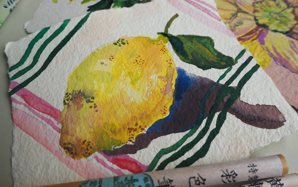
Japanese Gansai: Pastels and Shadows
Ellie, Choosing Keeping
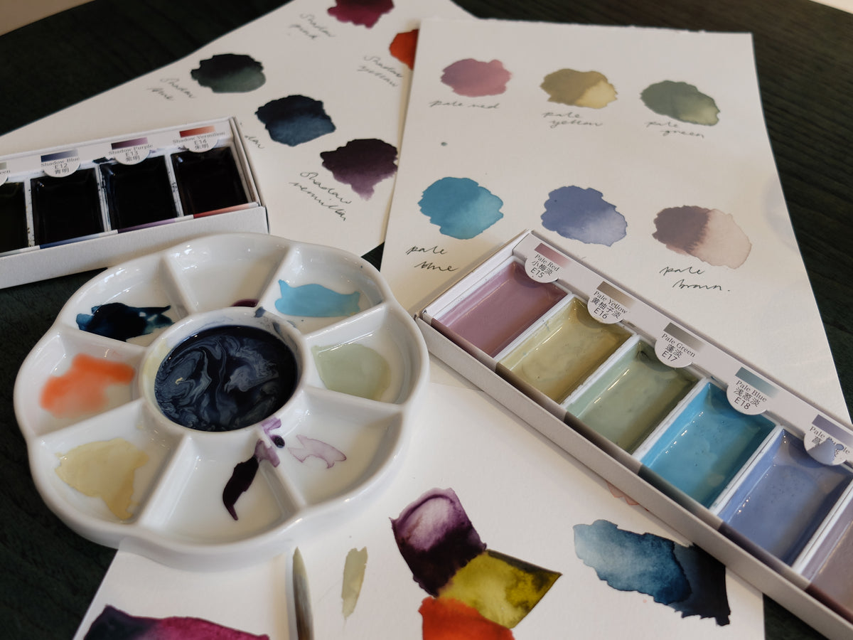
Introducing two new gansai paint palettes: a second edition of our Sumi-e watercolours, and a brand new matte pastel set. Our gansai watercolours have long been a shop favourite, and I was excited to be able to try out these recent additions.

Dating back to the Tang Dynasty of China and introduced to Japan by Zen Buddhist monks in the fourteenth century, the art of sumi-e is a long and rich tradition. Literally meaning ‘black ink painting’, sumi-e would originally take form in an ink bar that would be mixed with water to create a variation of black tones. Whilst they may look ultra dark in the pan, don’t let looks deceive you; this palette has a great colour selection - think slightly autumnal colours - which can be used with as much or as little water as you like, perfect for either more traditional, deeper tones or lighter, more vibrant tones.

The new matte pastel set is simultaneously bold and gentle and I really appreciated their propensity for even and brushstroke-free colour payoff. One of the delightful aspects of these paints is their capacity to be able to achieve both delicate and super opaque washes. These gansai paints offer a creamy and slightly thicker formula compared to watercolours and can be categorised as somewhere in between a watercolour and a gouache. The paint applied to the surface of my paper with an even and pigmented wash which I was quickly able to lighten with water.
Offering both simplicity and spontaneity, these palettes are ideal for anyone looking for an interesting new way to approach colour
Mini Cards with Huge Personality
Carla, Choosing Keeping

These rather cute and adorable mini cards have landed at Choosing Keeping. The mini cards could be used for an array of things, one of which could be for a ‘little’ note to a loved one or friend and can even be used to put a small trinket or gift inside.
We have two new ranges of these adorable cards ready to impress those who receive them.
The first new addition are our Woolly Animal cards which are very quaint and dainty cards, perfect for writing a little note. These come with a matching envelope and are blank inside so you can make your message as personalised as you’d like. Online these come in two curated assortments, one of which named birds and the other farmyard and friends. The woolliness are the small balls of fluffiness on the card that gives the item a little added texture and cuddliness.
The other is Embossed Flora and Fauna flat cards that come in an array of prints from gleaming cherries to statuesque leopards; cute and also vivid in colour to highlight the focus of the cards. On our website these can be purchased as a set with 6 different flat cards and matching envelopes; we have two assorted sets available. The flat cards are a great item to be used if you have a gathering and need place cards name labels or place cards. Fountain pen friendly to add a more personal touch. Additionally, the cream colour of the card keeps the area of writing your message neutral and classic so that you can illustrate or use calligraphy to your liking.

Both the Woolly Animal cards and the Flora and Fauna cards can be purchased individually so that you have the option of mixing and matching to your preference; all of which come with a matching envelope. Here at Choosing Keeping we are all into the small and compact items, there’s just something about something little and cute that we find adorable and unmissable.
Shop the Mini Flora & Fauna Cards here.
Shop the Wooly Animal Cards here.
Sakura Coupy Wax Crayons
Eleanor, Choosing Keeping
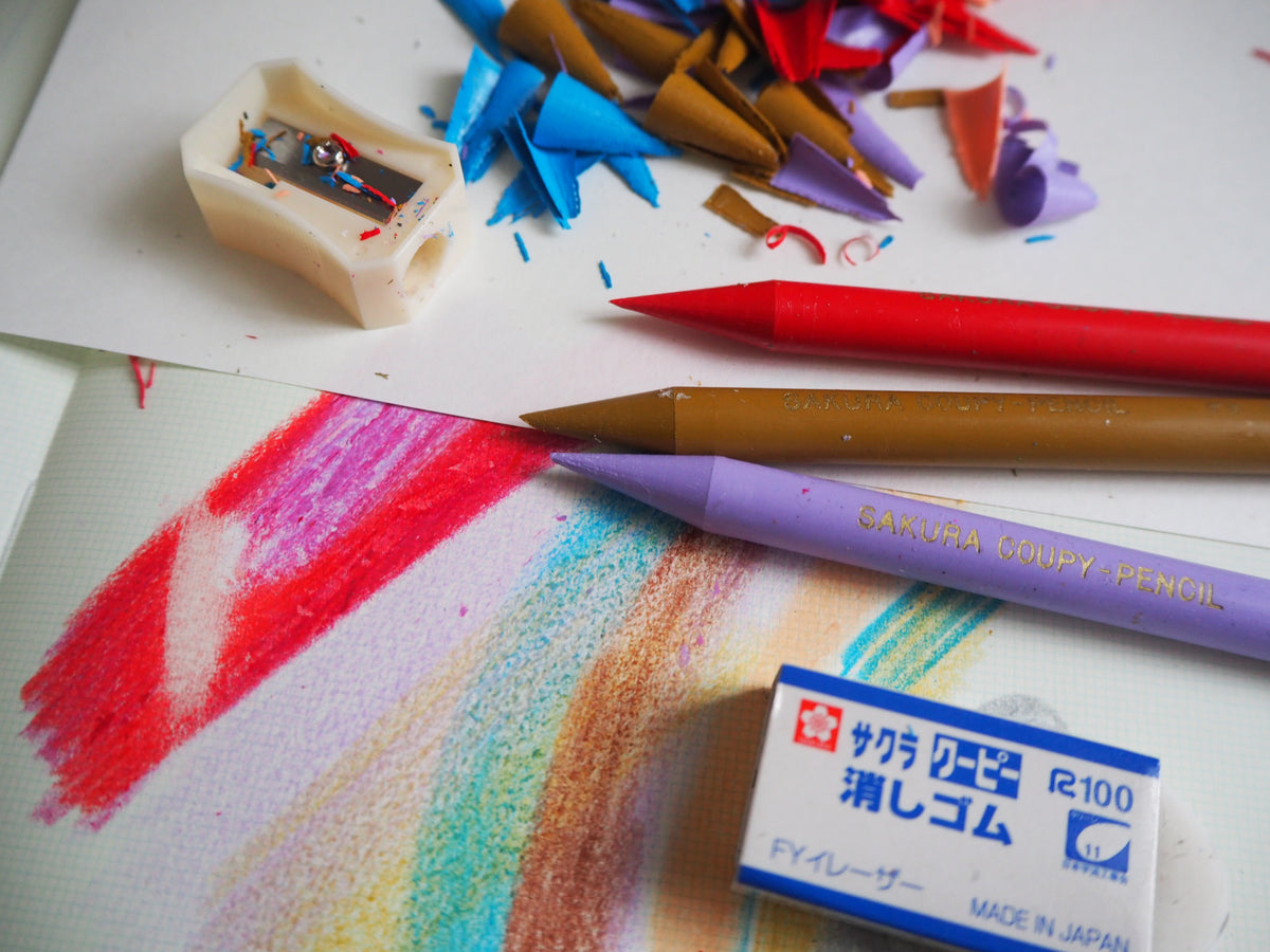
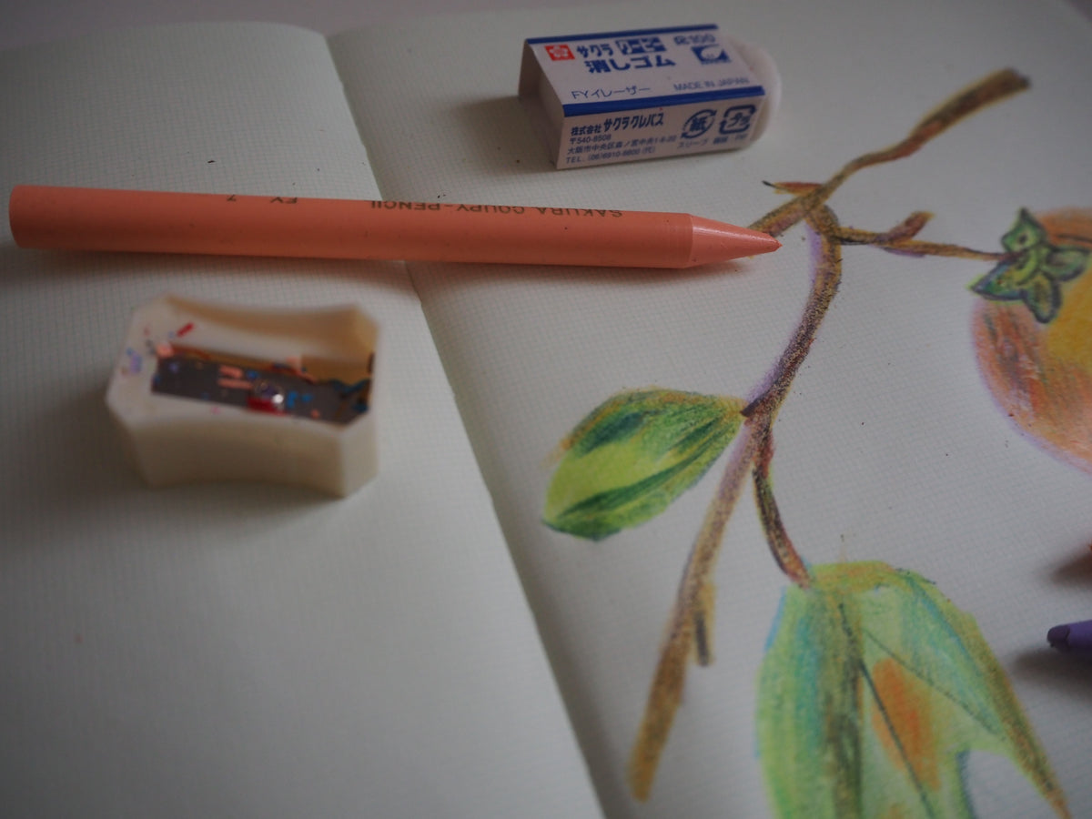
After a small hiatus, the 24 tin of Sakura Coupy wax crayons, a Japanese classic, have returned to Choosing Keeping! Looking at these crayons simultaneously reminds me of colouring at infant school and my days working at our old shop in Columbia Road, as this was one of the first items I bought from the shop! I am delighted that this tin is now available at 21 Tower Street.
Although some people may find this set desirable for the packaging and presentation alone, I urge adults and children alike to not only admire the tin, but to use these crayons in their creative pursuits. Compared to many art sets (traditionally) aimed at children, the colours in this set are highly pigmented and sophisticated; they can be blended or overlapped to build subtle tones or can be used with more pressure for bold and graphic lines. Unlike watercolour, the colours do not blur to a sludgy brown; when used together the effect is almost like a pointalism painting. One can clearly see all of the individual colours, but when placed beside each other, they blend in the eye to create new colours.
The set comes with a crayon sharpener - perfect for the more detail orientated artist - and an eraser which can knock back the colour on the page so you can overlap with another. It does not remove the crayon completely as the waxiness remains on the page.
Wax crayons can also be used as a wax resist when working with mixed media. This spring, why not experiment with a box of Sakura crayons and the botanical gansai set? Or take the tin and a pad of Zeichenblock drawing paper to an art gallery or museum for some low mess, in-situ observational drawing.
Shop the Sakuray Coupy Wax Crayons here.
Valentine's Love Letter Sets
Eleanor, Choosing Keeping
The gift for the first wedding anniversary is traditionally paper - maybe this is an echo back to the Valentine’s Day card that managed to steal the heart of your loved one?

Allegedly over 25 million Valentine’s cards are sent in the UK each year - how, then, do you navigate buying the perfect card that sends “the right message” to your beloved? We suggest choosing top-quality paper and traditional printing techniques that say “I love you” just as much as the message inside. You do not want to send a card that is the equivalent of buying flowers at a petrol station! I have cross-referenced our selection of romantic letter writing sets and cards to help you select the perfect writing material. None of our Valentine’s Day cards have a pre-written message, so you’d better brush up on your writing skills before the 14th February!

Valentine’s Day is synonymous with roses - how many times have you seen a large bunch of roses being delivered across an office in films and TV? This Italian Rose lined letter writing set is an excellent choice if you would like to send a discreet message in the post. The outside of the envelope is high quality but slightly boring so will not attract attention but on the inside you will find a lining of offset printed roses. I would recommend writing on this paper using a dip pen and a bottle of pink Sailor ink to complement the flowers. This set also comes with 10 cards and envelopes so it’s perfect if you want to send more than one…

If poetry and tomes of affection are not for you maybe choose this letterpress printed card. A banner of “Forever Thine my sweet one” held by a dainty hand is expertly printed onto thick card. It is the opposite of many flashy Valentine’s cards, perfect for someone who likes to be understated. However, it is not suitable for fountain pen so please pick your writing instrument carefully before scrawling “I love you”.

When this fuchsia and red envelope hits the doormat your loved one will certainly know they have a secret (or not so secret) admirer! Tasteful and elegant but also hot, hot pink! Why not seal the card using the romantic ribbons wax seal - that way you can be certain it will not be opened by prying eyes.

This Love Cats card is possibly the cutest Valentine’s Day card available at Choosing Keeping. Whats not to like about two cats snuggled up together? It is hard to appreciate in a photograph but the silkscreen print quality of this card is exceptional.
Shop our range of Valentine's cards and gifts here.
Brass Kaweco Sport
Alex, Choosing Keeping
Originally introduced in 1934, the Kaweco Sport was marketed to women, office workers and sportsmen due to its small, pocket-friendly size and innovative octagonal barrel. Thanks to this wide range of customers, the Sport became hugely popular and is synonymous with the Kaweco brand, being introduced in a multitude of colours and materials, from ebonite and aluminium to steel and brass.

When it comes to pens, as with many things in life, weight can equate to value. Like the heavy glass jar of an expensive skincare product, the brass sport has a presence in the hand forcing you to acknowledge its material and craftsmanship. This feeling is also present in the writing experience, where the substantial weight helps to push the pen across the paper effortlessly. The solid build of the pen is not only beneficial to the writing experience but the longevity of the pen itself.
Those who are a little less precious about their pens will appreciate the way this material ages and collect marks from its use. Unlike its acrylic counterparts, the Brass Sport continues to age as the material develops a rich patina on its surface. Of course this can always be polished back to its original high-shine finish, but I find the unique tarnishing to be a charming and personal touch of the material.
For those looking for a brass pen without such a hefty weight, the Kaweco Brass Liliput is an excellent option, with its compact body making it great for taking on the go, either in its standard style or the ‘Wave’ body - for those who like something that makes a statement.

Shop our range of brass and other metal-bodied pens here.
Food Candles: A Feast for the Eyes
Ellie, Choosing Keeping
Gone are the days of personality-dead, designer candles - camp is in. This kitsch collection of artisanal food candles, coveted by any charcuterie aficionado, are all made by hand in Italy by a small family-owned business where 'the art of working the wax’ has been handed down from father to son for six generations.
The 'cereria’ or wax laboratory, operating since 1840, began their candle journey with the production of church candles.

Today, the wax used in the process is paraffin wax of the highest quality, the same grade used as in the (real) food industry. In fact, many types of cheeses are coated in this wax for preservation purposes. Additionally, the wicks used are pure cotton, so all candles absorb the smoke and do not drip. But no, realistic as they may be, these candles do not smell like their respective food embodiment…alas, I had always wanted my home to smell of bresaola ham.
So while Summer (although very brief) has sadly and definitively come to an end, the joys of a picnic can be brought into the home with the added bonus of flammability and an unrivalled level of bold home decor.

Shop our range of food candles here.
Ceramic Palettes: The Unsung Hero
Ellie, Choosing Keeping
A scrap of magazine, a piece of cardboard or even straight from the paint tube and onto the canvas, the palette has often been a neglected part in my arsenal of painting tools.
Traditionally used to paint in the Nihonga style, each layer of the Five Tier Bone China Japanese Nihonga Palette can be used to blend pigment and binder. It is not only in the arts of Japan however that we see the use of separated saucers: most depictions of medieval painters at work show pigments in shallow shells or saucers. It was not until the 15th Century that the earliest depictions of palettes appear, interestingly in the hands of women painters, such as Iaia in Giovanni Boccaccio’s De Mulieribus Claris.

It was with this knowledge that I decided to make some quick watercolour sketches inspired by medieval manuscripts. With my British Earth Natural Pigments Watercolour Set and my paints set out like ‘A man with bowls of coloured paint’ from the Omne Bonum, I certainly felt like I had gone back in time - gone were the synthetic materials of mass-produced acrylic paint tubes and the plastic palette, and in their place were artisanal and handcrafted items.
But why use a china palette instead of the humble cardboard or even a plastic palette? The china palette is easy to clean and they rarely stain with watercolour. This palette in particular also features a larger surface area than palettes with more pans allowing for mixing space and larger quantities of product.
If you’re a person who tends to paint with a large array of colours then maybe other palettes such as the Japanese Bone China Ceramic Palette with 21 holes would make a better painting companion. However if you want to focus on a few core colours or want to use a larger quantity of a particular colour then perhaps give this one a try. I enjoyed having a small dish dedicated to a single hue - it helped me to really look at the colours I was using. Whilst the use of watercolours may not be the primary intention, I think it highlights the versatility of the palette and perhaps even to some extent the fact that there really are no rules when it comes to creating something.
Shop all ceramic palettes and accessories here.


Glue: The Underdog of Stationery
Eleanor, Choosing Keeping
Glue transports me back to school, whether it be collaging with sequins and pasta, covering my entire hands in PVA and then slowly peeling it off, or trying to desperately get the final bit out of the plastic bottom of a glue stick to finish my project in the small hours of the morning… the list goes on. Glue is a product that, for many, in adult life takes a bit of a back seat but at Choosing Keeping it is one of the items that we are most often asked “what is this” over the counter. Yes it is true, we have chosen our range of glues because the packaging is so enticing but we also rate them for their performance, stickiness and natural qualities. All of our glues are non-toxic and suitable to be used by children.
Yamato “Nori” Glue
If you do bookbinding or work with extremely delicate papers, such as katazome or chiyogami, I could not recommend this Japanese glue more. The non-toxic, acid-free formulation of tapioca starch and water, manufactured by Yamato since 1899, makes for a delicate glue that can be spread very finely, used with precision or watered down for papier-mâché. The soft pink, yellow, green and blue tubes with a yellow cap have been housing the glue since 1956 and are individually filled by hand!
Coccoina Glue
This iconic tin of glue paste has been manufactured in Italy since 1927 from potato starch, water, glycerine and almond essence. An Italian favourite, which is worth buying for its marzipan scent as much as for the glue itself. Inside the aluminium tin you will find a solid glue that, in a similar way to a glue stick, melts when used. The small brush inside the tin is ready to spread the glue directly onto the page when collaging. Not suitable for anyone with a nut allergy.
Gum Arabic
"Kristall-Gummi" water solvent glue has been produced in Germany since the 1940s using the natural gum collected from Acacia trees. It can be used for delicate papers but I would recommend spreading it extremely thinly so the paper doesn’t buckle. Another popular use for this natural gum arabic glue is as a binder for pigments, especially watercolours - in fact our Tuscan watercolours are bound with gum arabic and honey. I think this is the most “grown up” glue in the Choosing Keeping selection, the traditional glass bottle is an extremely attractive item for your desk.
Puppy Head Glue
This cute puppy head design has been filled with glue since 1975. Although do not worry, no puppies were harmed in the making of this glue! - the paste is made exclusively with corn starch and water so is safe for children to use as technically you could eat it (although I would not recommend that!). Inside the red flat cap lid you will find a small spatular but if you want to cover a larger surface area I would recommend using a brush. I think this makes an extremely sweet gift for anyone who enjoys some after-school crafting.


Cat Paperweights
Alex, Choosing Keeping
Having a partner who is severely allergic to cats has really limited my options when it comes to having a feline friend at home. With our not-so-subtle range of cat themed items in the shop, I am sure I can find a way to work cats into my day to day without causing any undue issues or allergic reactions. When the new additions to our John Derian decoupaged paperweight range arrived with us, I knew these could be just what I was after.
Black Cat
A classic piece of imagery, the black cat hints to witchcraft, superstition and a quick-witted companion to Sabrina Spellman. Jumping straight out of a children’s illustration book, the imagery for this paperweight feels very fitting with our hissing cat stickers, perhaps the perfect gift wrapping addition if you were passing this on as a present.
Country Cat
The Country Cat design is a friendly face, the tabby cat you see wandering peacefully around your neighbourhood. Fitted with a very smart little red bow tie, it is clear to see why he is so popular amongst visitors to the shop. Thanks to the dome shaped glass of the paperweight, his face can be seen almost following you around the room.
Kitty
This little white kitty doesn’t look too pleased trapped in the arms of the young girl holding him so tightly. This Regency style image lends itself to those who might be looking for a more subtle way to sneak a cat themed decoration into their home; certainly subdued in comparison to some of our more kitsch selections!
Find our John Derian paperweights here.


The Pencil, a History of Graphite, Wood and Feuds
Amanda, Choosing Keeping
This story does not start with a pencil. It starts with the assumption, made by author, scholar and engineer Henry Petroski, that “Just as there is no artefact that is without engineering, so there is no engineering that is free of the rest of society”: innovations, both impalpable and life-altering, don’t originate from a simple spark, a stroke of genius, but from a combination of patience, planning, calculation, creativity and competition.
Pencils, like the most elaborate progeny of engineering mastery, enshrine the secret of determination, sheer talent and a consistent amount of…good timing. In spite of its presence in our everyday life, the pencil is an invisible miracle of technique and innovation.
In his book The Pencil - A History of Design and Circumstance Petroski intertwines the evolution of our beloved writing tool to the history of the world - more specifically Europe and the United States (with some journey to Siberia and India) - and unearths the indissoluble links between the ever-changing sociopolitical landscape and the evolution of craft and engineering in the Western world.
“This is so because the engineering and the marketing of the pencil are as inextricably intertwined as they are for any artifact of civilization” he states.
Interspersed with wars, family feuds, holy matrimonies and over-the-top advertising, the history of pencils is also a study in human ingenuity - and the relentless exploitation of workforce and natural resources, the birth of unions and worker strikes and the 40-hour-work-week -, accessories and marketing: the competition between beloved brands such as Faber Castel and Koh-I-Noor was played on the field of dedicated designs, colours, leads and shapes, appealing to both the broad market and specific professional needs.


How hexagonal pencils are made.
An Ancient Technique in a Modern Day Tool: Japanese Brush Pens
Silvia, Choosing Keeping
Since working at Choosing Keeping over the last three years, I had the opportunity to rekindle a long lost passion of mine: calligraphy. Thanks to the abundance of chances to practice such art, deepening my own freestyle technique here at the shop (all staff also attended a calligraphy workshop), I have the opportunity to try some of the best 'writing instruments' available on the market. I love how each tool or pen is different and offers the best approach to whatever handwriting you need on the occasion.
Ink brush is a writing technique used in Chinese calligraphy - an art of writing practiced in the regions of the Chinese cultural sphere: Korea, Taiwan, Vietnam, China, and Japan. It is believed that ink brushes were invented in China somewhere around 300 BC. Ink brushes are still made today in Japan and some very special ones (available at our shop), are traditional premium brushes, beautifully hand-crafted in Kyoto using bamboo reed handles and natural hair bristles. But what about their counterparts: the more modern brush pens?
In short, the difference between a calligraphy brush and a brush pen is: one requires manually coating the bristles in pigment and the other contains pigment that is fed to a brush tip from inside the body of the pen. Basically, brush pens spare you the trouble and mess of handling your own pigment. Also, they are usually cheaper than specialty brushes and safer to carry around. Coming with a variety of synthetic tips to mimic the qualities of brush bristles, their tips work beautifully for lettering, especially for artists looking for versatility, practicality, cleanliness and an accident-free job.
The Usu-Zumi felt tip pen is one of our most popular brush pens at Choosing Keeping. Usu-Zumi come from the Japanese word 'usu' meaning pale and 'sumi' being the black ink used for traditional calligraphy. Ideal for drawing and writing, this Japanese brush pen has a soft felt nib which replicates the feel of writing with a traditional brush.
Varying pressure will allow you to seamlessly create both thick and thin lines for smooth lettering and line work. As its felt tip is made from plastic, it tends to be firmer and requires less control for producing consistent lines. While most modern brush pens are disposable and less sustainable, our Usu-Zumi pen is refillable, for the more environmentally-conscious artist. It works with ready to use black, water-based ink cartridges.

Find the Usu-Zumi pen here
Summer Celebrations: Italian Wrapping Papers
Frances, Choosing Keeping
We have decorative paper for all occasions at Choosing Keeping - including, of course, for a trip to the seaside! If you have a summer birthday coming up why not go for a fresh British holiday theme. We’ve got shells (a staff favourite), boats and coral if you’d like to imagine travels a bit further afield.
The paper is thick enough for crisp folds and clean, straight edges when wrapping. Years of gift wrapping experience has taught me that the trick for the best results is that you need to be more forceful with the paper than you think… this requires wrapping tools that can hold their own including generous and firm paper stock. I use classic and ultra-sharp Choosing Keeping Italian scissors which glide freely through the paper and magic tape for almost invisible seams. Finish with ribbon and stickers if you’re feeling fancy.
All of our wrapping papers are printed in Italy using a non-digital technique called offset printing which results in a soft matte finish. The papers I used today were printed by a family business that took over from the great Remondini family, who were prolific in printing inexpensive papers in Bassano Del Grappa in the late eighteenth and early nineteenth centuries. Originally block printing techniques were employed and the papers were typically used for book binding or covering furniture.
Whilst we sell the bulk of our Italian papers today for wrapping, the uses for them are really endless and there there is no limit to the creativity that you can express with a simple sheet of paper. Think box making, lining drawers and any manner of decoupage applications à la Remondini tradition. Indeed friend of the shop John Derian makes beautiful nautical paperweights if you need a bit of inspiration!

Find our wrapping papers here
Flowers in Bloom: Botanical Paperweights
Carla, Choosing Keeping
Beautiful hand crafted paperweights perfect for desk or mantlepiece. These natural works of art have been dipped in UV resistant resin meaning that their vibrance will not fade over time. They are available in a range of different flowers, making them suitable for any individual as each has its own story and symbolism.

The Nigella flower (pictured above), also known contradictorily as love-in-the-mist or devil-in-a-bush, is apt for this time of the year as they bloom in the early summer. It symbolises the bond between people; appropriate for the current climate during the pandemic.

The Purple Thistle, the national emblem of Scotland. With its beautiful royal purple colour, it has accentuated the longstanding and proud representation of Scottish history and culture for over 500 years. The Latin motto of the Thistle ‘memo me immune lacessit’ translates as ‘no one attacks me with impunity’, encouraging bravery and loyalty.

In comparison to some of the other more dainty botanical paperweights, the Teasel flower stands out from the crowd as its architectural body is so diverse amongst the rest. A prickly flower that is ‘egg shaped’ which contains hundreds of mini flowers packed together. Teasel is also known as 'brushes and combs' which relates to the Middle Ages when it was used in the textile industry. The teasel flower is indeed different, but it is needless to say that it is far more interesting than it may seem at first.
Find our botanical paperweights here.
I Should Be So Lucky: Good Luck Stickers
Eleanor, Choosing Keeping
The new addition to the Choosing Keeping sticker repertoire, the ‘Good Luck’ sticker, is the ideal way to seal letters or decorate postcards and presents. This die cut viridian green and gold deluxe sticker is produced using traditional printing methods and gold engraving which shines bright in the sunshine.
The four-leaf clover is a traditional Celtic charm, and universally accepted symbol of good luck. Apparently Ireland has the highest concentration of four-leaf clovers (most likely because of the climate of the Emerald Isle…) hence the saying “the luck of the Irish”. In the Middle Ages many children believed that these rare mutant clovers offered magical protection, would ward off bad luck and when held would allow you to see the fairies. The first literary reference to back up their claims of good fortune was made in 1620 by Sir John Melton, “If a man walking in the fields find any four-leaved grass, he shall in a small while after find some good thing.”
According to tradition each leaf on the clover is supposed to represent faith, hope, love and luck. We all need a bit of luck every now and then, which is why this emblem is so prevalent!
Choosing Keeping “Good Luck" stickers are available in packs of 10 and can be found at Choosing Keeping alongside our hissing cat stickers, traditional labels and 80’s nostalgic stickers. Top tip: decorate your gift wraps with a confetti-style sticker medley for the ultimate maximalist lucky-charm effect.

Find our Good Luck stickers here.
Author's Choice: Ink Review
Neil Gaiman
When approaching the idea of writing his first novel, Stardust, author Neil Gaiman decided to purchase a fountain pen and leather journal, to elicit the feeling of writing a novel as if it had been written in the 1920s. Since then, the initial drafts of his works have been written by hand, with various fountain pens including the Pilot Custom 823 and the Lamy 2000 (both of which are filled by a piston refill mechanism, a sort of built-in reservoir - perfect for writers and notetakers alike due to its large ink capacity).
Find the Usu-Zumi pen here
His work, across the fields of comics and graphic novels, fiction, radio, and film and television, has often emphasised the art and ritual of storytelling as much as the story itself. Indeed, what better way to explore this idea than to use a pen and ink, taking the time to write each sentence, fully realising your characters and plot?
Well, don’t take it from us - hear it from the man himself. Neil has kindly reviewed some of our best inks, read his thoughts here.

Summer Seasons Gansai
A standout line from our product range, the Seasons Gansai sets took us from a purist stationery shop to Japanese paint aficionados over night. Sitting somewhere between a watercolour and a gouache paint, gansai have larger pigment particles meaning the colour sits on the paper opposed to sinking into it, offering vivid colours with opaque full coverage.
Although titled ‘Summer’, this palette is a versatile collection of colours and the name acts simply as a starting point to draw inspiration from. Along with the expected rich fiery reds and creamy golden browns of the summer sun, this palette mixes things up with colours such as Kujaku-Ao a deep teal, Koubai a hot almost-neon pink and Paaru-Midori a cool toned metallic blue-silver.
Each of the Seasons paint sets is presented in a box decorated with a Japanese chiyogami paper that corresponds to the theme of the season, this particular design features rich golden cranes flying over summer landscape, a traditional motif in Japanese painting and art.
For the best experience when painting with any of our gansai sets, we recommend pairing your paints with the Aquarella watercolour paper for a bright white base or the mixed cotton paper to really experience the opacity of the gansai. Our Japanese brushes are an ideal match for traditional painting techniques and are available with a variety of tip lengths and sizes for different uses.
- Alex, Choosing Keeping

The Father's Day Gift Guide
Here at Choosing Keeping we understand the art of gift giving; how to pick out the ideal gift for your loved ones and wrap it to perfection. Bring your Dad to the shop on Sunday and we can help you to select the perfect present. I have put together some “tried and tested" suggestions below for those who are stuck for ideas!

Stalogy notebooks have been a Choosing Keeping favourite since our days on Columbia Road; once you start using this notebook it is difficult to swap to using anything else. The stealth black exterior is very understated but the paper inside is a next level ultra-smooth bible paper which is the perfect partner for your fountain pen. If you prefer something more decorative how about a marbled notebook which also has excellent ruled fountain pen friendly paper?

After a long hiatus we finally have Choosing Keeping pen pots back in stock! Each pen pot is made in the UK using hand marbled paper or the hand Lino printed “Kings Bird” print. This practical gift will brighten up even the most boring desk set up! I suggest picking out a few pens and pencils to put inside the pen pot to complete the gift.

This handcrafted Italian lacquer-like leather card holder is perfect for storing business cards, or indeed credit cards. Over time the leather will soften slightly and develop a beautiful patina.

This granite colour way is the latest addition to our collection of Ohnishi Seisakusho fountain pens. The body of the pen is made from acetate that is hand turned on a lathe in Japan by Mr.Ohnishi himself. (You can read more about how Mr. Ohinshi produces the pens here).The fine Schmidt nib is smooth and suitable for everyday writing. As each pen comes with a converter cartridge you could even pick out a bottle of ink to complete the gift, I would recommend a bottle of the Noodler’s ink in Q’Eternity.
- Eleanor, Choosing Keeping
Retro Gansai Sets With Maria Ines Gul
Can you tell us a bit about how you have used the retro paint sets?
At first working with these unusual colour palettes put me out of my comfort zone but it ended up being an extremely fun process. After a couple of experiments with textures, I picked four ideas from my sketchbook and created illustrations for each set of paints. I often find limitations like a narrow number of colours extremely liberating, 8 shades feel just right for me.
How would you describe painting with the gansai paints? Do they feel different to the standard watercolours?
The gansai paints are just my cup of tea! In my work I like to mix different watercolour and gouache textures, meandering between the delicate washes and super thick opaque block shapes. I was shocked to discover that these paints can magically do both. I love how deliciously pigmented they are. These paints are definitely thicker and more chalky than traditional watercolours, but with just the right amount of water they can create rich and dreamy watercolour washes. The sets have the cutest packaging, a real eye candy on my desk.
How do you pick your subject matter for a painting?
Everything usually starts with a feeling, sometimes I like to pick a line from a song’s lyrics / poem as a starting point. Women definitely play a central part in most of my work. I have recently discovered that I really, really enjoy painting fabulous hairdos.
Is there a style of painting/particular artists’s work that you admire?
Oh, I am definitely obsessed with the artistic group formed by Eric Ravilious, Edward Bawden, Enid Marx & co. For a brief period during the 1920s they all studied together at the Royal College of Art under Paul Nash, I was so ecstatic to find that out as a student there almost a hundred years later.

The Perseverance of Paper Marbling
"A question we often debate in the stock room of Choosing Keeping when contemplating our next batch of boxes, notebooks or pen pots is whether marbling is over. Indeed we have been guilty of covering almost everything we touch in this unique decorative paper and we have scoured the globe for the top marblers, each with their own area of expertise and specialised technique. Today I hope to make the case that this wonderful and historic technique is far from over…

One of the most common marbled paper types is called Turkish Spot (above) - named for the type of paper marbling that was developed in Turkey in the 15th century. Originally known as Ebru, or cloud art, in its most classical form it is comprised of spots of paint with a distinct vein running through. These papers are very recognisable and commonly found in traditional bookbinding as either cover or end papers and is familiar in period as well as modern day cinema.

Named for its European origins, the Spanish Ripple (above) was developed in the 19th century. The ripple effect is created by softy rocking the paper as it is placed on top of the bath where the marbler has carefully laid out their design. An added step is necessary to create the rarely found moiré effect pictured: the paper is first folded into squares in order to generate a more distinctly irregular wave.

Find all our marbled papers here!
Often considered to be a more conservative marbling technique, these intricate comb designs (see previous column) require an extremely steady hand and precision of eye to pull the paint through the water with a series of specially designed combs. The soft tones in the paper pictured create a gently fluid effect. Traditionally marbling was a highly secretive craft and it was typical that even those involved making the designs would not know the full process - each step would be carried out in private by a different craftsman.

This strange, almost amoebic, design (above) is a more unusual variety of the historic technique. The chemical nature of the craft is here most visible as the separation of the paint into the distinctive tiger eye pattern is cased by ox gall (acid from the belly of an ox) mixed with different sulphates. It is extremely difficult to master and increasingly hard to find such spectacular modern made examples."
- Frances, Choosing Keeping
Labels & Stickers: A Traditional Touch
"One of the most popular items in our shop isn’t even one we sell: our Choosing Keeping bird sticker always grabs the attention and desire of anyone who has had a package or envelope sealed with one. Although we don’t have these available to buy, we do have a specially curated selection of labels that evoke the same charm and character.
Cat Stickers - A more recent addition to our collection, our Smiling Cat and Hissing Cat labels are something straight out of a retro Halloween storybook. Unlike digitally printed stickers, these die-cut designs have a traditional, slightly textured finish - perfect on the back of an envelope or for decorating a present.
Traditional & Classic Labels - A familiar sight for anyone who has purchased one of our own Choosing Keeping Composition Ledgers, we love to pair these labels with the ledgers, using them as a name plate on the front cover. Available in both a decorative traditional design and a clean, classic alternative, each style comes in a variety of colours suited to match all uses (a personal favourite is the lime and brown combination). As well as adorning the front cover of notebooks, they make for excellent address labels - a much needed change from the usual printed addresses we so often see.
Bird 'To' Labels - This twist on the classic Choosing Keeping bird sticker is the perfect finishing touch for any present or letter. Cut to our instantly recognisable swallow shape, these labels feature a warm gold trim for a subtle luxurious feel. The smooth matte paper makes it ideal for writing or stamping recipient’s names on to address all letters and presents. Although we originally made these as a Christmas item (it is never too early to think about the holidays) this sticker is suitable for labelling gifts year round thanks to its understated style and appeal.
Jam Jar Labels - The unsung hero of home organisation, the jam jar label is a tried and tested favourite here at Choosing Keeping. Not just for jam jars, these small labels are ideal for labelling spice racks, cupboards or even pots of your own handmade paint from our Japanese Pigment Sets. With 48 labels in a pack there’s no end to the amount of things you can organise!"
- Alex, Choosing Keeping


Leather Notebook: Business on the outside, party on the inside
"Are you looking for a notebook that will make a memorable impression at your next face-to-face business meeting, or a notebook to jot down all of your favourite London haunts? I may be biased but I think this sartorial Choosing Keeping leather notebook ticks all of the boxes, combining form and function. Slick, stealthy and discreet on the outside, with vibrancy and pizazz on the inside. This little black book is handmade in the UK using top quality materials and traditional bookbinding methods that originated with the production of small pocket bibles.
The cover is crafted from supple and textured black goatskin leather that ages and develops its own patina over time. On the inside you will find lined cornflower blue paper which is an excellent dancing partner for your fountain pen (I use the Pilot Custom 74 Soft Fine). The notebook is thread-stitch bound in small sections so once opened the pages lie flat on the desk, making it easier to write notes or long form without having to awkwardly hold the pages down.
As with many bibles, this notebook has traditional "red under gold" page edges that only shine red when the pages are flexed. It is subtle, but this design detail adds to the drama!
The surprise end papers, made out of psychedelic hand marbled papers, add a flash of colour when the notebook is opened; each individual notebook has a different marbled paper, a satisfying way to differentiate phases for those who like to repeatedly use and collect the same design of notebook. Imagine these notebooks full of ideas in a row on your office shelf… wouldn’t that be satisfying.
Our leather notebook is available in A5 or a smaller 'pocket' size, which fits perfectly in a jacket pocket."
- Eleanor, Choosing Keeping


Paint making with Pear Fleur
Can you tell us a bit about your new paint making video?
The new paint making video features the Saiun-do Kyoto Nihonga Mineral Pigment Set in Red Camellia. Inspired by the Japanese camellia, the set includes vibrant reds, lush greens, striking gold and other rich pigments. The careful curation of the pigments inspired the resulting red camellia painting that is created at the end of the video.
The video is part of a series of paint making videos that were created in partnership with Choosing Keeping. This particular video is very special to me because I was going through major life changes while producing it - the serenity and patience that the paint making process induces helped me through extremely stressful times. My only hope is that those who watch will experience some amount of calm no matter what they are going through.
Which technique do you use to transform the pigments into paint?
There are two techniques that I currently use. The first technique is by grinding the pigments into a fine powder, pouring a bit into a ceramic plate, and mixing the paint with Nikawa Japanese binder glue with my fingers. This is a traditional technique that is typically strategically carried out during the painting process itself, and the paints become very permanent after they dry.
To make paints that are more like re-wettable watercolors, I mix the ground pigments with glycerin, gum arabic, distilled water and a touch of honey. Then, I use a muller (that was graciously gifted by Choosing Keeping!) to coat each pigment granule with the mixture. I’m still practicing and learning how to get better at making the paint - thus my paint making videos are not instructional in any way.
What do you think is the main advantage of using the pigments instead of pre-made paints?
The very first time I made paints, I asked myself the same question after many failed attempts and frustrations that came with the learning process. However, the difference between the two is similar to eating homemade food versus eating at a restaurant. Yes, both options are delicious and fill you up, but at the end of the day, doesn’t the food made at home by someone you love always taste and feel more special?
You have now sampled all 3 of the floral pigment sets, which colour combination do you like the best?
That’s such a hard question!! It’s like trying to choose your favourite star at night. But if I had to choose, the Blue Iris set feeds my love of painting with blue tones.


Sumi-e Gansai: More Than Meets the Eye
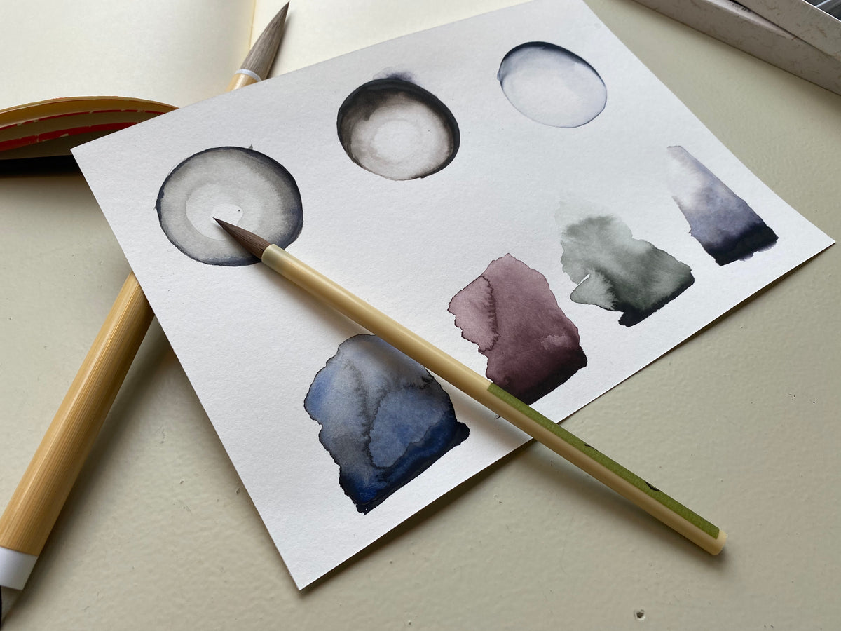
"Among our range of Japanese gansai paints the Sumi-e palette is the most inconspicuous. Its six dark colours don’t offer much to gawk at in the pans, however in action they might just be one of the most interesting colour ranges we have.
Sumi-e literally translates to ‘Black Ink Painting’, originally a technique that used an Indian ink bar mixed with water to create varying tones of black. You can still find the ink in its bar form as well as a liquid version popular for drawing. This method relied on the purely monochrome palette to depict traditional scenes of natural flora and fauna. An extension of Japanese calligraphy, Shodō, and its physical movement and tools, sumi-e paintings feature an absence of illustrative lines, instead using carefully curated strokes and stains to depict form.
This take on that same traditional sumi-e takes the best bits of the limited palette and skews it a little towards those who may be more accustomed to working with colour. Each of the deep black paints lifts into light muted colours perfectly suited to the understated traditional Japanese subjects.
For more controlled painting, working with the gansai in a ceramic palette allows you to easily create various values of the same colour. These mixes can then work together to create soft but dramatic transitions; ‘Reddish Black’ works its way from a deep warm black into a soft berry shade and ‘Purplish Black’ lightens into a cool wintery violet.
Unlike a standard pan watercolour, gansai paints have a creamy and slightly thicker formula, something between a watercolour and a gouache. Paint applies to the surface with high coverage and concentrated pigment but can quickly be lightened with water to create barely-there washes and stains. A learning curve for someone like myself who hasn’t had previous experience with gansai, I was quickly able to pick up how to work with this punchy formula. Offering an interesting new way to approach colour (or a lack of), the sumi-e palette is ideal for anyone feeling a little stale with their own colour choices and looking for a new challenge."
- Alex, Choosing Keeping

Traditional Japansese Shodo calligraphy - the masters of this tradition were known as 'the three brushes' - Kukai, Emperor Saga, and Hayanari Tachibana
Japanese Pens: The Extraordinary Everyday
"It probably comes as no surprise that we here at Choosing Keeping are obsessed with all things Japanese. From our pigments and paints, brushes and paper, right down to the tiniest erasers and clips. Of course the same goes for pens, but today we’re not looking at the lavish gold nib fountain pens from Sailor or Platinum, but rather the everyday companions of our pencil cases and desks.
This week we take a look at a small selection of our Japanese stationery range fit to suit all needs: From super fine technical pens to the humble ballpoint, we have it all.
Hi-Tec-C - Perfect for the smallest of details, the Pilot Hi-Tec-C comes in four sizes: 0.25mm, 0.3mm, 0.4mm and 0.5mm. Despite the incredibly small line width, the Hi-Tec-C uses a biopolymer gel ink to deliver super smooth lines without bleeding. An innovative rollerball system sits at the tip of the pen, eliminating any skipping and ensuring clean lines across the page. Since its launch in 1994 this unassuming detail focused pen has been a fan favourite among writers and artists alike.
Mitsubishi 550 - For those looking for a retro flair, the Mitsubishi No. 550 might just be the perfect pen. This sophisticated ballpoint takes its design directly from its 1965 predecessor, a reflection of the brand’s significance in Japanese stationery manufacturing. The minimal branding and sleek design lend the 550 an air of clean and cool style while the writing is effortless with a smooth line needing minimal pressure. An elevated take on an everyday staple, its no wonder this classic pen became so popular.
Boxy - Jump forward a decade and we meet the Mitsubishi Boxy ballpoint. With its clean lines, flat edges and matte finish this 1979 design still feels modern and new today. Delivering the classic ballpoint writing experience with a smooth flow, the body provides a surprisingly comfortable grip that the hand naturally falls into. The click-propel and side release mechanism are extremely satisfying to use - you may find yourself clicking away without realising, much to the dismay of those sat near you.
Frixion - This minimally designed pen offers a smooth writing experience with minimal pressure, but its the ability to erase the ink which is the star of the show here. With the rubber tip eraser one can now simply remove any mistakes or mishaps even when written in ink. Through friction (now you get where the name comes from) the ink is heated up and effortlessly disappears from the page in seconds. A “see it to believe it” type of trick, this pen is something plucked straight out of an international spy novel and put straight into your hands."
- Alex, Choosing Keeping

Kaweco Special: The Designer's Choice
"By far our most popular writing utensil for architects and designers is the Kaweco Special mechanical pencil. In fact, thanks to its four lead sizes, it is suitable for all means of illustrating - from fine technical drawing with a 0.5mm lead to broad sketching and shading with the 2.0mm. The design first appeared in some capacity in 1927 - pictured is the modern Kaweco Special with a vintage version from our archives. You can clearly see that the model sold today takes direct reference from its ancestor; now produced with an upgraded push-button mechanism for added ease of use and with a durable aluminium body.

This week I have been testing the shorter version of the pencil, which suits smaller hands and is ideal for use on-the-go, but it is also available in a longer size for those looking for something more substantial and with a bit more weight. Overall this classic mechanical pencil is very comfortable in the hand; the aluminium is soft and sturdy and the hexagonal barrel means it won’t roll off your desk!
0.5mm - Unless you have specific requirements for extremely fine lines I would never recommend anything finer than a 0.5mm lead; any thinner and it can become prone to snapping. The .5 is perfect for fine drawing, drafting and writing - you can control the darkness of the line very easily by applying more or less pressure.
0.7mm - This is the most popular lead size we sell - still precise like the .5 but the slight upsize makes the lead more durable and recommended if you are looking for a thin line but are a touch more heavy handed. Equally suitable for drawing and writing.
0.9mm - A slightly more unusual lead size which is more suited to sketching or everyday writing rather than fine technical drawings thanks to the thicker, stronger lead. Depending on how you hold the pencil you can exert some control over the line size as the lead is wears down producing a slanted tip. Very smooth.
2.0mm - The lead inside this holder is the same width as that which you would find inside a regular wooden pencil. It feels far firmer under hand and is ideal for broader lines or shading. A lead pointer can be used to sharpen the lead into a point for more detailed work making it a versatile option for those with multiple requirements. "
- Frances, Choosing Keeping
Straight to the Point: Snap Blade Cutters
"I remember scouring for good quality cutters since my early days at the Central Saint Martins College of Art, when I had to build miniature models for my Interior Design course. If, like me, you are a perfectionist who needs the absolute best tool to avoid a bad temper while involved in painstakingly difficult and methodical projects, then I would highly recommend this precision knife, made in Japan.
The Japanese reputation for top quality sword forging and its labour intensive blade-smithing process dates back to the 1100s, with the traditional Japanese samurai's katanas still regarded as being the world's sharpest swords. It comes at no surprise that Japan is good at making modern cutters too!
I recently started a new project building decorative boxes using upcycled cardboard, decoupage and Choosing Keeping's Italian papers.
I cannot tell you the amount of precision cutting involved in the process, and the reliable assistance I found in this sleek, long-lasting knife by NT, who, alongside Olfa, developed snap blade technology in the late fifties in Japan. The 9mm stainless steel blade with its 30 degree angle tip is ideal for intricate works. At its end, the cutter incorporates a built-in blade with auto-lock and a snap-off tool to change the edges once worn. Also, a practical clip makes it possible to attach it to your sketchbook or pocket and my favourite added bonus is its interchangeable blade which can switch sides and be used by left-handed users as well. This design is tested and enjoyed not just by myself but by architects, designers and artists who shop with us."
- Silvia, Choosing Keeping

Notes on Nibs: Testing Fountain Pens
Choosing Keeping is fundamentally a brick and mortar shop and we value the tactile nature of stationery as well as the joy of physical shopping. Indeed, the stationery connoisseur will agree that there is no greater satisfaction than feeling the softness of the best writing paper or musing over the subtle differences between pencil grades. But it is the fountain pen that benefits most from an in-person purchase. It’s all about trying the pen and working out what barrel size fits best in your hand, what material and weight you find most satisfying and, most importantly, what nib size and type best suits your individual handwriting. Indeed, the unique nuances of nib types across brands cannot be translated into a digital language - but that hasn’t stopped us trying!
Nib Taster Notes:

Sailor Blue Dwarf, £140 - As is typical with Sailor, this is a well rounded and reliable nib. It writes true to size - a touch on the thin side - with some bite and feedback. The flow is consistent and little pressure is needed for ink flow; whilst firm, there is some line variation possible with more considered writing.
Material: 14k gold with rhodium tip
Sizes available: Fine, Medium, Broad, Music

Lamy 2000, £175 - Very wet with high lubrication; on the broader size of medium, there is not much precision but the generous flow lends well to faster writing or for those who enjoy the variation of tone in inks. The tip is well-rounded which produces an extremely smooth finish, almost gliding across the page.
Material: 14k gold with platinum coating
Sizes available: Fine or Medium considered writing.

Ohnishi, £160 - £175 - True to a Western fine, it is comparable to a Japanese medium. With its steel nib it feels firm and there is no real line variation possible. A good everyday writer with a study and reliable line that does have some give over continued use - it has quite a dry nib which may benefit lefties or those in need of a quick dry.
Material: Gold-plated stainless steel, by German manufacturer Schmidt
Sizes available: Fine

Pilot Prera, £48 - This pen would be ideal for those looking for detailed writing or drawing; definitely on the finer side, it is quintessentially Japanese in its precision. Very firm and smooth, there is certainly some bite but no line variation possible. As steel nibs go this is exceptional, but I would recommending upsizing as the fine can feel a touch scratchy.
Material: Steel
Sizes available: Fine, Medium, Italic (CM)

Platinum ‘sheep’ Leather , £185 - Whilst Platinum in general tends to runs very fine, this nib is true to size with a very generous and consistent ink flow. Some line variation is possible with gentle pressure and it feels soft and balanced. With its leather barrel and no threading, it feels comfortable and warm in hand.
Material: 14k gold
Sizes available: Medium
- Frances, Choosing Keeping
Three Pages a Day
"When typewriters were popularised in the late 1800s there was significant and immediate backlash from the portion of the population (many of them poets and novelists) who saw the interference of machinery in the process of writing as somehow tainting the purity of thought and expression. Of course today, in an age where using a typewriter is a romantic alternative to the everyday use of a computer, writing by hand is seen by many as a redundant exercise … I do not! Whilst perhaps slightly biased by my profession, I sincerely believe that there are a huge wealth of benefits to writing by hand - and as often as possible.

Far from the careful bullet journalist, my daily writing is free flowing and admittedly erratic. Loosely following the ‘morning pages’ technique of writing three pages to no one in particular, it is more about the handwritten process and the train of thought followed than the look on the page. My companion of choice is Choosing Keeping’s own composition ledger (A5 ruled is my preference) - I love the huge variety of spine colours and cover combinations.
Many of our customers express anxiety over writing on the first page of a new notebook and whilst there is certainly a peculiar power to blank pages and the potential they hold, I assure you that there is nothing more satisfying than a full one (or five!). And what better way to mark the start of the astrological year than with our zodiac composition ledger? Having just passed through the equinox we have officially entered Spring under the sign of Aries. As the first in the zodiac, Aries is associated with new beginnings and a fiery energy that frankly couldn’t be more welcome this year.

The cover is produced by perhaps my favourite paper supplier. Italian of course and the inheritors of the great Remondini printers who were so prolific in their paper production from the 17th to 19th centuries - in fact this notebook is a real love affair with Europe as they are also bound on the continent. The paper on the inside is what I would describe as easy going: For particularly fussy fountain pen users I would recommend an MD or marbled notebook for maximum smoothness, yet I am perfectly happy using my trusty Lamy Safari (who can resist this years’ special editions) for quick, regular and meditative writing."
- Frances, Choosing Keeping
A Colour Palette for Nature
"Yamato-e painting, developed in Japan’s golden age, the Heian period, is a classical Japanese style of painting which interprets the beauty of nature and the changing seasons. These highly detailed paintings often depict narratives, landscapes and the four seasons Shiki-e. Many Japanese festivals and rituals follow the seasons - spring is regarded as the first season and a breath of fresh air as buds begin to blossom upon the trees and shoots push their heads through the ground.
See the bottom of this article for some examples of classical Japanese Yamato-e paintings that illustrate the spring sensibility.

Gansai paints are made in Japan using a colour palette specific to Kyoto, Japan’s imperial capital during the high middle ages, and codified in a colour dictionary pointing to precise references in nature.
Choosing Keeping’s Spring paint set borrows from this chromatic lexicon - the bright green tones of Wakaba or fresh leaves, purple from wisteria, and of course pink from, Sakura (cherry blossom), which is a key Shinto symbol of spring. How romantic that Japanese colour nomenclature don’t pertain to chemistry - but rather references subjective emotions and fleeting observations of nature. For example, Akebono-iro - the palest light pink refers to ‘daybreak colour’ or Hatoba which can be translated as ‘pigeon wing’.
If you consider that each colour is so well considered, Gansai paints are not intended, at least in theory, for mixing. Compared to the Western style half pans (think Winsor and Newton), assai are presented in large and wide full sized pans, designed to be used straight out the palette, ready to accommodate a generous paintbrush without splitting any bristles.
This unique feature encourages expressive and uninterrupted strokes, equally minimising the need for mixing palettes.
Gansai’s particular strength is its versatility - either opaque, thick and creamy for a texture reminiscent of gouache - even pale and light colours can be laid over dark papers with obvious contrast similar to dry pastels. Add water and the paints resemble Western style watercolours - more give, more luminescence and transparency.
I tested the Spring watercolour set using the Tokuseu Saishiki and Kijiku Itachi premium Saiun-do brushes on rose, clay, white, and olive handmade paper cards. As the year progresses, I plan to test the summer, autumn, and winter watercolour sets to paint with the seasons."

- Eleanor, shop manager
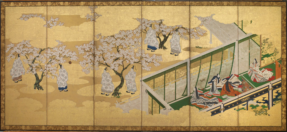
The Tale of Genji, Chapter 34; Kashiwagi catches sight of the Third Princess, Tosa Mitsuoki (1617-1691)

Tosa Mitsunobu (1434-1525) Tsukimine-dera (Geppoji) konryu shugyo engi (History of the Founding of the Geppoji Temple) 1495
A Nib as Soft as Butter: Pilot's Custom Soft Fine

“My fountain pen of choice is the Pilot Custom Soft Fine. Its 14k flexible gold nib is a niche specialty nib type, unique to Japanese pen makers and manufactured by Pilot since the 70s. It produces a unique sensation of varied line width as you exert more pressure on downward strokes, combining calligraphic flair with razor precision. You'll find the effect extremely pleasing whether you are patiently carving each individual stroke into the page but also when writing naturally in a frenzy as ideas spill out of your head.
A popular sales line for a gold nib is that it will mould to your personal hand(writing) - is it a myth?
4 years of continuous years of daily writing and I can confidently affirm that it is no lie. Using a gold nib pen (versus a steel one) is a game changer - something like the Eureka moment for any chef discovering that butter is the secret ingredient to deliciousness.
I use a CON-70 converter cartridge and am currently enjoying Alt-Grun by Rohrer and Klingner, pictured. Yet another benefit of a refillable cartridge system, to enjoy a rainbow of ink colours in a thrifty and environmentally friendly way."
- Eleanor, shop manager