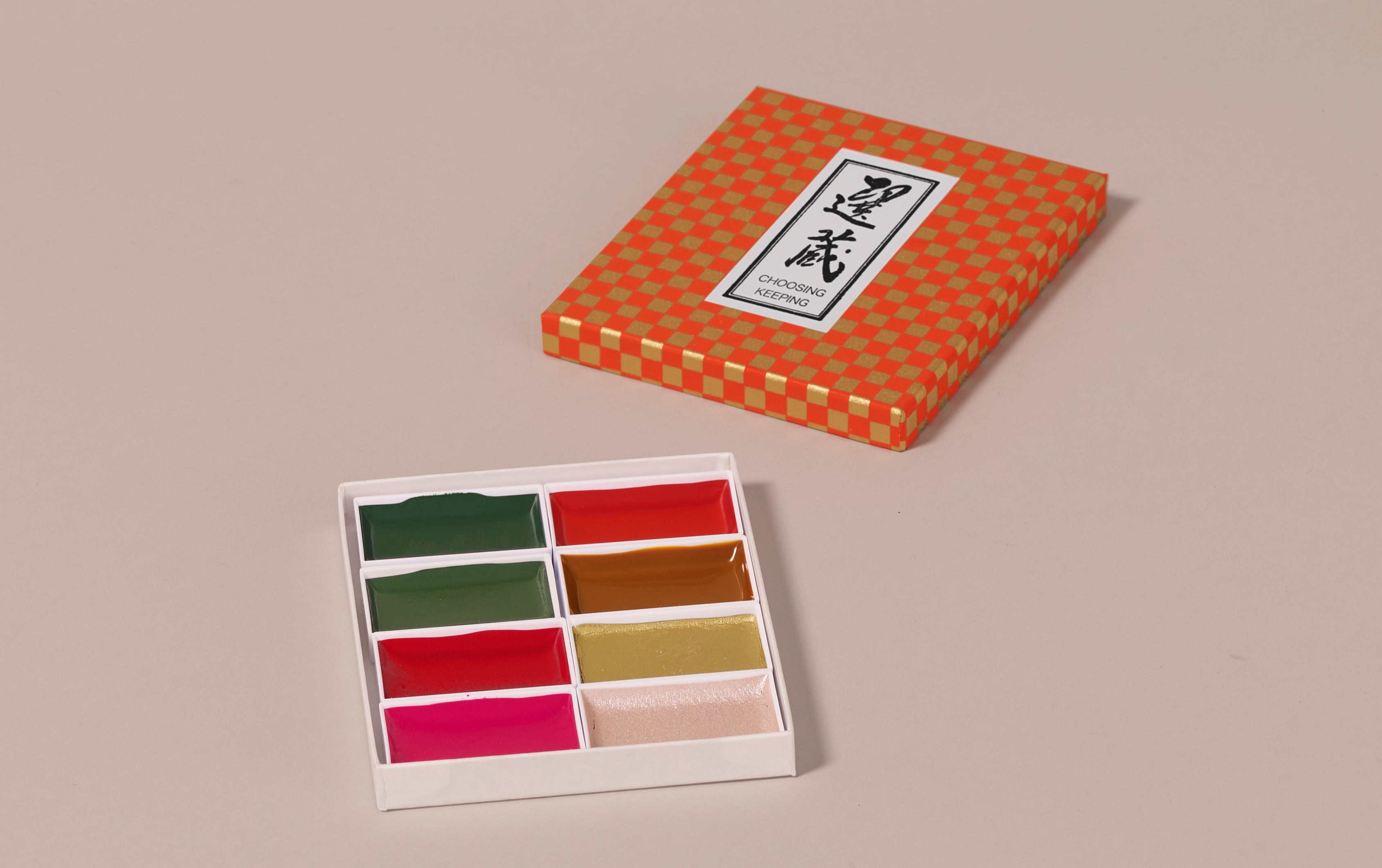


Choosing Keeping Retro Watercolour Set, 20th Century Part I
- Description
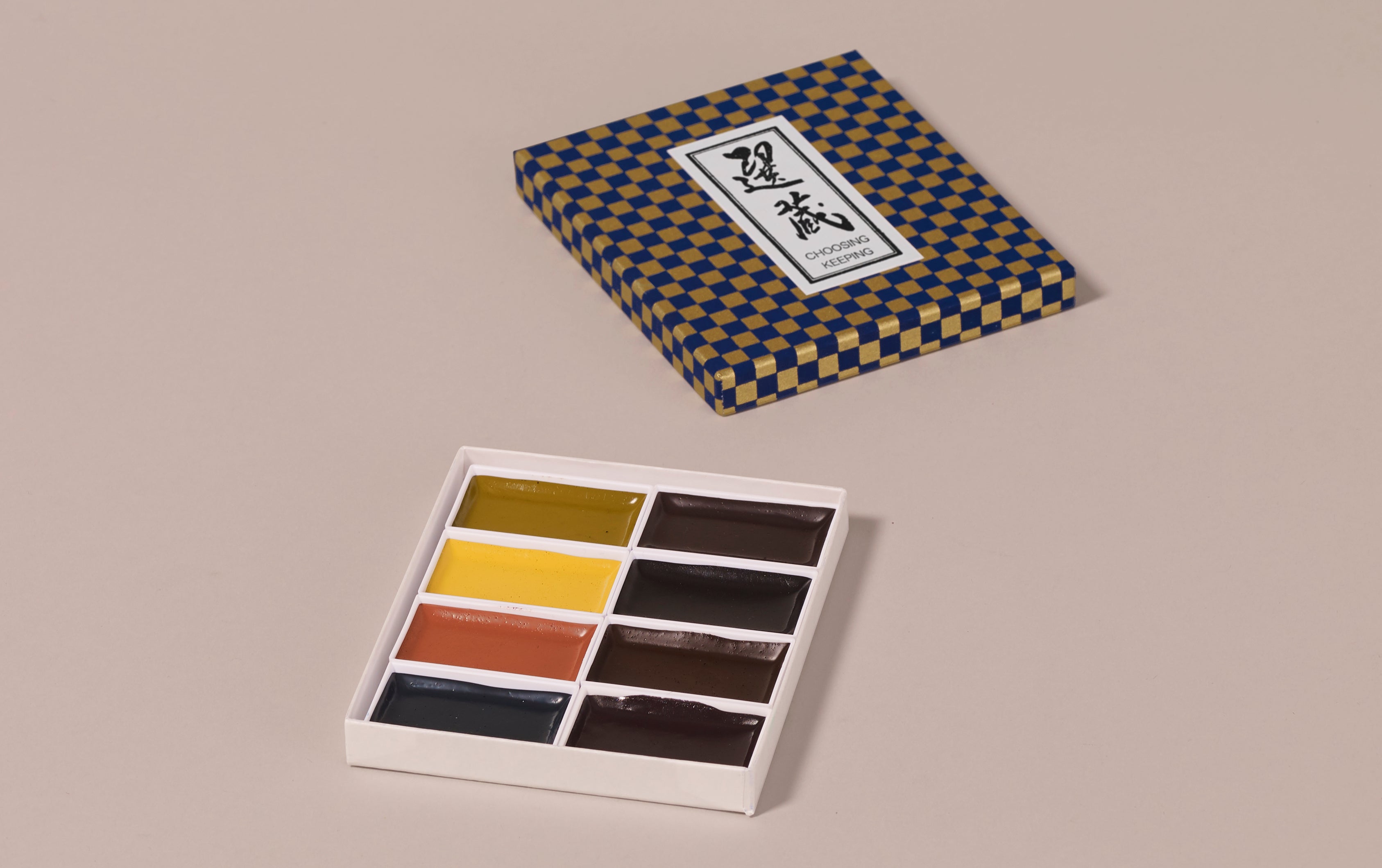
Choosing Keeping presents seven exclusive, special editions of 8 shades of Gansai. This Japanese alternative to standard European watercolours is not dissimilar to gouache and is made by a 100 year old paint maker in Japan. The paints can be used directly out of the box with a wet paintbrush - either thinly in translucent washes, or by layering for a bolder effect. These can also be used on darker paper bases to enhance colours further.
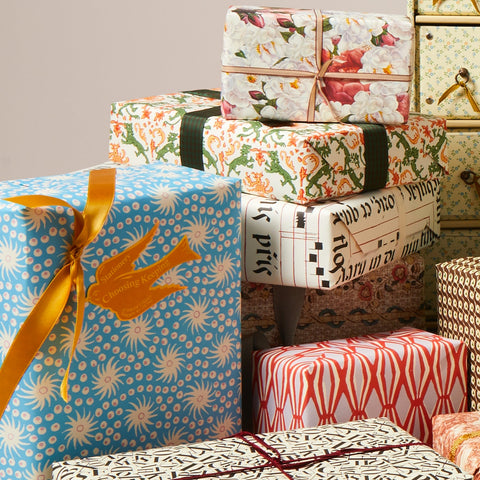
Choosing Keeping's own take on this traditional Japanese art material, each set in this retro collection is inspired by colours of a decade past: 20s, 30s, 40s and 50s, each has its own appeal. Put together they are the perfect set for a gift. We recommend the Aquarella (white) and Aquarello (off-white) for the perfect paper pairing.
Included with each set is a blank letterpress swatch card featuring each individual colour name to be painted in for colour referencing. This can come in handy as appearances can be deceiving and each colour is only revealed once wet and set to paper!
Details:
Material: Gansai watercolour
Included: 4 palettes each with 8 colours in chiyogami paper presentation box and 4x blank letterpress swatch cards which can be painted in for colour reference.
Vegetarian/ Vegan: No (contains gelatine glue binder)
Non-toxic
Made in Japan
Colour breakdown:
Swatches and illustrations courtesy of Maria Ines Gul
- More Like This
Gift wrapping available
Worldwide delivery
FAQ
Do You Offer Gift Wrapping?
Yes, gift wrapping can be chosen before checkout and is a £10 flat fee, which includes a card and envelope for you to leave a message. We use premium materials, our in-house Italian paper and Swiss ribbon and an assortment of branded stickers.
How can I amend my order?
Once placed, orders cannot be modified and the address cannot be changed. This is to avoid errors in processing. If you have made an error, please email to request a cancellation, you can then place a new order with the correct details. Once shipped an order cannot be cancelled, it will need to be returned.
What if something is out of stock?
If an item in your order is unavailable, our team will contact you in writing to let you know and discuss your options. We’ll do our best to suggest alternatives or advise when the item is expected back in stock. During busy seasonal periods, if an item under £10 is out of stock, we’ll issue a refund for that product and send the rest of your order so you receive it without delay.
Can I buy gift vouchers?
Digital Gift Cards can be purchased through our website and are delivered by email, these are redeemable through online purchases only. In-store only gift vouchers can also be purchased by visiting us at our physical store in Covent Garden.
Can I collect my order in store?
Yes, if the items in your basket are available at our shop in Covent Garden, you will be able to select “Pick Up” at that location. Not all items will be available at this location.
Shipping
International shipping
We ship to all Worldwide destinations exclusively using DHL Express. For UK destinations DHL Express is a 24h next working day delivery service.
Dispatch Time
We aim to despatch orders within 48 hours. At busy shopping periods this can take an extra few days. Orders placed after 1pm on Fridays and at the weekend will be sent out Monday at the earliest.
Taxes
Shipping to USA, Europe, Canada, Australia, and New Zealand will be sent Delivered Duty Paid (DDP). This means all customs duties, taxes, and handling fees are already covered at checkout—so your order arrives without any unexpected extra charges.
About Us

Choosing Keeping is an independent shop located in Covent Garden, London. We specialise in offering a wide range of stationery and miscellaneous items to cater to all your needs.

We take pride in offering products that inspire creativity and elevate the art of writing. Whether you're looking for a special gift or simply want to treat yourself, we invite you to explore our collection and discover the joy of stationery.

We offer gift wrapping with premium materials, our in-house Italian paper and Swiss ribbon and an assortment of swallow branded stickers. We ship to all destinations worldwide by DHL.